Design comparison
Solution retrospective
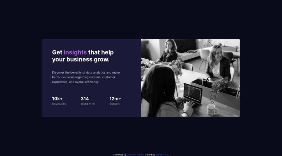
I completed the task as mobile and desktop task. In general, I think I am successful. However, I couldn't do what I wanted to apply a filter to the photo. The feedback you gave me about the mistakes I made in the code I wrote is very important to me. Thank you...
Community feedback
- @Nick331102Posted almost 3 years ago
This is the easiest way I have found for the overlay, but there are other ways try using an inset box shadow box-shadow: inset 0 0 0 1000px rgba(109, 54, 199, 0.596); you can adjust the color.
0 - @skyv26Posted almost 3 years ago
Hi! It is really good that you believe in quality work.
I saw that your design is not that much responsive but it is ok. But in some device there is unnecessary space at bottom and at some device your insight data going outside from your card.
Please fix it and overall good work.
0
Please log in to post a comment
Log in with GitHubJoin our Discord community
Join thousands of Frontend Mentor community members taking the challenges, sharing resources, helping each other, and chatting about all things front-end!
Join our Discord
