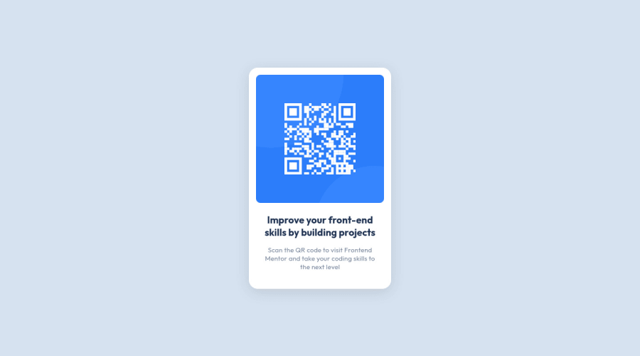
Pixel perfect with popup and fancy loading and hover animations
Design comparison
Solution retrospective
I improved my previous solution by improving almost everything. Now with figma and better experience I was able to create pixel perfect or almost pixel perfect solution to this challenge and I'm really proud of it.
Things I included in this solution:
- On load animations for image and text
- QR code popup with black glassy background (with animations)
- Better responsiveness (it's not perfect)
To open the popup, you need to click on the image. To close it, you need to click anywhere outside the image.
I learned a lot about animations and trasitions doing this challenge and I recommend you guys to try making more and more fancy animations in your future projects.
Any feedback is welcome here!
Community feedback
- @dwhensonPosted over 2 years ago
Nice one! The solution looks great - here are a couple of small points to consider:
- I noted that your popup is a link element. I wondered whether this should rather be a button as it triggers an action rather than moving the user to another URL?
- Also once the popup image is open there is no way to close it using the keyboard. A little JS might help here as otherwise keyboard users will be trapped.
Lovely job!!
Cheers Dave
Marked as helpful0@GrzywNPosted over 2 years ago@dwhenson I wanted to avoid using JS in this project, so I decided to use CSS a:target approach.
I improved my solution based on your recommendations, so I added close button for popup (also it was possible to close it before using keyboard, but it wasn't really intuitive) and set
role="button"
toa
tags.Cheers!
1@dwhensonPosted over 2 years ago@GrzywN perfect!! Works really well now. I hadn't thought about added an aria role instead of changing the element. Lovely!!
1 - @mayankdrvrPosted about 1 year ago
Congratulations Karol for completing this challenge. Your design matches the solution well.
- An observation is that below 340px width of screen, the text and card gets hidden(does not resize) and text does not wrap. Maybe, you can set the maximum width of card to be upto 100% of width of its parent container.
- Avoid using <div> element in html file and use semantic html elements throughout the code for better web accessibility.
Awesome solution and keep it up.
0
Please log in to post a comment
Log in with GitHubJoin our Discord community
Join thousands of Frontend Mentor community members taking the challenges, sharing resources, helping each other, and chatting about all things front-end!
Join our Discord