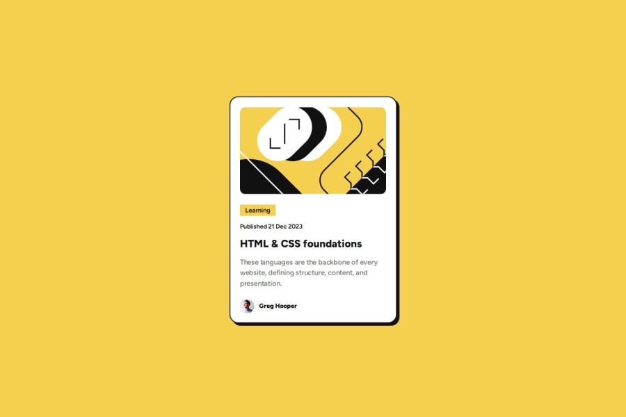
Design comparison
Solution retrospective
I'm most proud of the clean and organized structure of my HTML and CSS code. I've made sure to use semantic HTML tags for better accessibility and SEO, and I've managed to keep the CSS well-structured and easy to understand. The use of CSS variables and the box-sizing property have also helped in creating a more efficient and maintainable codebase.
If I were to do this project again, I would consider using a CSS preprocessor like SASS or LESS. I would also consider adding more comments to my code to make it easier for others (and future me) to understand the purpose of each section. Lastly, I would look into making the website more responsive for different screen sizes using media queries.
What challenges did you encounter, and how did you overcome them?One of the challenges I encountered was ensuring that the layout and design were responsive and looked good on different screen sizes. To overcome this, I used media queries in my CSS to adjust the layout and design based on the screen size.
Another challenge was managing the CSS for the different elements in the HTML. With so many elements, it was initially difficult to keep track of the styles for each one. To solve this, I used CSS variables and organized my CSS in a way that made it easier to understand and manage.
What specific areas of your project would you like help with?I would like help with improving the responsiveness of my design. While I have used media queries to adjust the layout for different screen sizes, I’m still not completely satisfied with how it looks on all devices. I would appreciate any advice or best practices on creating truly responsive designs.
Additionally, I would like to learn more about optimizing the performance of my CSS. While I’ve tried to keep my CSS clean and organized, I’m sure there are ways to make it even more efficient.
Lastly, I’m interested in learning more about accessibility in web design. I want to ensure that my web pages are accessible to all users, including those with disabilities. Any resources or tips on this topic would be greatly appreciated.
Community feedback
- @nicolette-codesPosted about 1 year ago
Hi, I like the work you did here. It looks like you used mobile first approach which is really cool.
Regarding feedback:
- In case you haven't already looked into it you can maybe check out the BEM methodology to better group your class names.
Marked as helpful0@pettikPosted about 1 year ago@nicolette-codes Thank you for your feedback! 😊 I followed your advice and adjusted my HTML and CSS code to the CSS methodology (BEM). 👍
1
Please log in to post a comment
Log in with GitHubJoin our Discord community
Join thousands of Frontend Mentor community members taking the challenges, sharing resources, helping each other, and chatting about all things front-end!
Join our Discord
