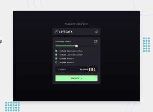
Password Generator made using Vanilla JS + Sass
Design comparison
Solution retrospective
This project was a lot of fun. I made a custom range slider for the first time that works in Chrome and Firefox (not sure about Safari). One interesting challenge was determining the strength of the password to be generated. The strength will update based on all the options, although the scale is completely arbitrary 😅. Making the 4-bar strength component was made simple thanks to some cool CSS selectors. All I had to do is change the data-value attribute in JavaScript and the CSS takes care of the rest.
.scale {
  &[data-value="1"] :nth-child(1) {
    --color: var(--red);
  }
  &[data-value="2"] :nth-child(-n + 2) {
    --color: var(--orange);
  }
  &[data-value="3"] :nth-child(-n + 3) {
    --color: var(--yellow);
  }
  &[data-value="4"] :nth-child(-n + 4) {
    --color: var(--green);
  }
  ...
}
Let me know if there's any bugs or improvements I could make. Thanks!
Community feedback
- @elaineleungPosted about 2 years ago
Hey Curtis, this was fun to play with as well! I like what you did with determining the strength of the password based on the combinations. It also looks and works great on my phone and desktop.
One UX comment I have is, when it first loads, I didn't realize the password was already generated, and so when I started looking at the bits more closely and changing options, and then generating the first password myself, I actually couldn't tell there was a change, since a password was already there, and then I ended up generating another password out of confusion 😅. I don't know, but maybe an empty state might have helped lessen the confusion for me. I'm interested to see how other users find it too!
That's all to report back on, and as usual, great work, looking forward to the next one 🙂
Marked as helpful1@crsimpson5Posted about 2 years ago@elaineleung Hey, Elaine. That's a great suggestion for the UX. I can see how that can be confusing. I think staring at a project for a while you become blind to these things, and that's why a second pair of eyes is so helpful. Thanks for the feedback!
1 - @DonUggioniPosted about 2 years ago
Hey there, I'm working on this project now, great job on completing this one!
I'm kinda stuck on the range bar trying to figure out a way to change the background dinamically, I looked through your code but couldn't understand what you did to make it work.
What was your approach?
1@crsimpson5Posted about 2 years agoHey, @DonUggioni I had trouble finding a straight-forward approach, so my solution is a bit of a mess. I'll try to explain.
Here's the markup. I hid the range input's track and added an element that I could style.
<div class="range">
    <input type="range" ... />
    <div class="range__track"></div>
</div>
JS:
lengthRange.addEventListener("input", (e) => {
  // get the value, min, and max attribute values from the range element
  const value = parseInt(e.target.value);
  const min = parseInt(e.target.min);
  const max = parseInt(e.target.max);

  // calculate percentage for how far the slider is along the track
  // and converts to string i.e. "50%"
  const width = ((value - min) / (max - min)) * 100 + "%";

  // set the custom property on the range input's wrapper element
  range.style.setProperty("--width", width);
});
CSS for the custom track div:
range__track {
  z-index: -1;
  position: absolute;
  width: 100%;
  height: 8px;
  top: 50%;
  transform: translateY(-50%);
  pointer-events: none;

  /* Set background to a gradient where the first color ends at 50% and the second color begins at 50% (I find this syntax odd, but it works). */
  background-image: linear-gradient(
    to right,
    var(--green) var(--width, 50%),
    var(--gray-800) var(--width, 50%)
  );
}
Let me know if you still need help, or figure out a better solution 🙂
0@DonUggioniPosted about 2 years ago@crsimpson5 Thanks for the reply!
I actually tried setting the background to the input using the linear-gradient with the percentages and then manipulate the percentages with JS but couldn't get it to work for some reason, the style is not being applied.
But this gave me some ideas and I will try to implement something. If I come up with something different I will let you know =)
Happy coding!
1@DonUggioniPosted about 2 years ago@crsimpson5 Hey, so I came up with a different solution, thought I'd share it with you:
Here's what I did:
For the HTML:
              <div class="selectors__progress"></div>
              <input
                type="range"
                min="0"
                max="20"
                value="0"
                id="range"
                class="selectors__slider"
              />
            </div> ```

CSS:

``` &__range-box {
    position: relative;
  }

  &__progress {
    position: absolute;
    background-color: var(--cl-neon-green);
    width: 0;
    height: 0.8rem;
    top: 0;
    left: 0;
  } ```

JS:

``` sliderEl.addEventListener('input', function () {
  const value = sliderEl.value;
  progressEl.style.width = `${value * 5}%`;
}); ```


Took me 4 hours to come up with this 😂
Marked as helpful0@crsimpson5Posted about 2 years ago@DonUggioni Haha, this is a much simpler solution than mine. Love it, well done 😃
0 - @Chanda-AbdulPosted about 2 years ago
Well done! The 4-bar strength component is pretty tricky, the solution you came up with is very clever and elegant!
0
Please log in to post a comment
Log in with GitHubJoin our Discord community
Join thousands of Frontend Mentor community members taking the challenges, sharing resources, helping each other, and chatting about all things front-end!
Join our Discord
