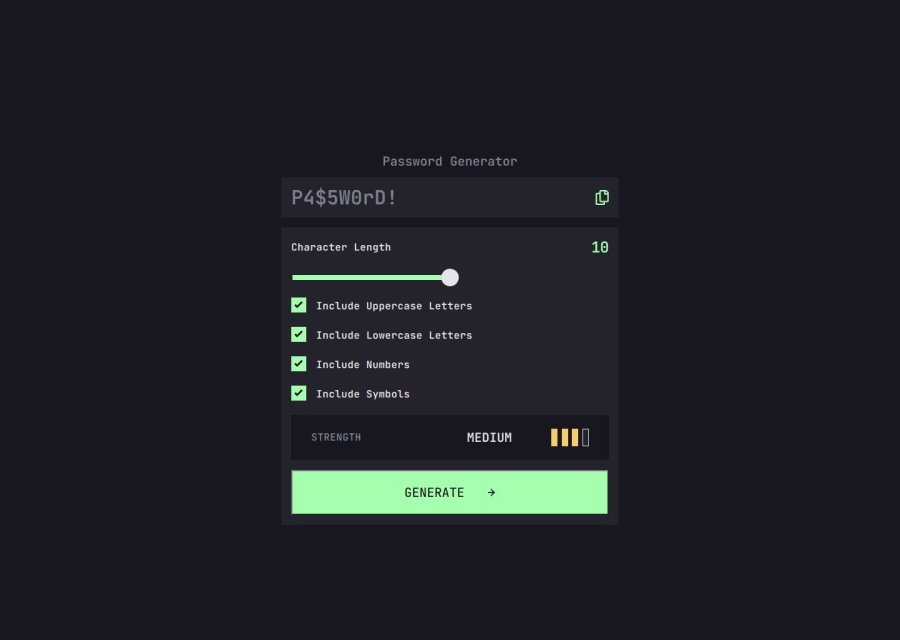
Design comparison
Solution retrospective
I was able to build this app reasonably fast, and I think a bit more precise than previous challenges.
What challenges did you encounter, and how did you overcome them?Styling sliders and checkboxes proved to be far more complicated then I thought. With the help of ChatGPT I could solve it.
Community feedback
- @MargaritaBusyginaCaPosted 5 months ago
For the styling, you might want to increase the padding for your form. The spacing between password strength (for example, "Strong") and the strength boxes need to be smaller - you can try using flex on that container and then adding gap to it.
Marked as helpful1
Please log in to post a comment
Log in with GitHubJoin our Discord community
Join thousands of Frontend Mentor community members taking the challenges, sharing resources, helping each other, and chatting about all things front-end!
Join our Discord
