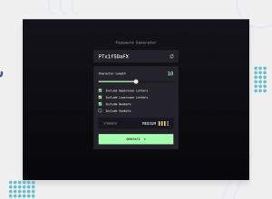
Password-Generator-App_TypeScript_Html_Sass/Scss-Bem_Responsiv
Design comparison
Solution retrospective
For this project, I focused on implementing a clear and well-structured logic. Each functionality is encapsulated in distinct functions with clearly defined responsibilities, such as password generation, strength evaluation, and security bar updates. This approach ensures that the code is both maintainable and easily extensible for future improvements.
I also paid close attention to thoroughly commenting the code, making it easier to understand and follow for anyone who might work on it.
The event management is well-structured as well. Event listeners are properly attached to the DOM elements, with clear conditions for activating the different options. The handling of password state and its related options is efficient, with synchronized updates to the interface.
Overall, the project is built to be both robust and user-friendly.
What challenges did you encounter, and how did you overcome them?One of the main challenges I encountered was the thought process behind the implementation, which required careful planning. I spent time ensuring that I followed best practices to deliver solid, maintainable, and readable code.
I had to do some research to implement certain features, particularly the password generation logic, the dynamic visual updates when manipulating the slider, and the rendering of the security level bars. Additionally, I looked into how to implement the copy-to-clipboard functionality, ensuring it worked seamlessly within the app. Overcoming these challenges involved learning and applying new techniques while maintaining code quality.
What specific areas of your project would you like help with?I would like to get a review on the logic part of the code, specifically to see if there might be an alternative approach that could improve it.
Community feedback
- P@NikitaVologdinPosted 6 months ago
The layout looks great! Just for perfection: – The gap between checkboxes and labels might be decreased a bit. – Hover effect for the thumb of the range input for now it works only for active state. – For me, the max range input value looks more 20 then 16. – On sm screen resolution fonts look way bigger and label checkboxes wrap on the second line. – The "To week!" state overlaps with neighbour elements. – The white color for the copy button should be on the active state not hover – The "Copied" notification looks too little. The app works well and is nice! Logic part: – With no selected checkboxes the app gives the "Medium" state. – The app doesn't generate a password with the selected options if the character length is set to less than 6 (included). – With no selected options or length = 0 the copy button copies placeholder text to the clipboard. But it might be not a bug, but the feature =))
Sorry for such amount of comments I know it is annoying after well-completed work. But it is what it is. I believe you noticed most of them yourself, but I hope you fond something knew.
Thank you for reading Best, Nikita
Marked as helpful1
Please log in to post a comment
Log in with GitHubJoin our Discord community
Join thousands of Frontend Mentor community members taking the challenges, sharing resources, helping each other, and chatting about all things front-end!
Join our Discord
