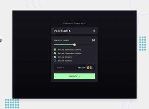
Password Generator App | Solidjs - Typescript - Postcss
Design comparison
Solution retrospective
Hello everyone 😊. This is my solution for the Password Generator App challenge.
It is the second time I use solid-js and it went pretty smooth! I love the framework. It feels like an hybrid between React and Vanilla JS.
I added two little bonus :
- Generate only strict passwords (at least one character of each selected rules).
- Toast notifications success/error (copied to clipboard).
Regarding accessibility as always I tried to do my best but this time I used a new pattern.
I tried to not use the disabled HTML attribute but work with the aria-disabled instead. It means that I i am required to check for the validity of the inputs in the JavaScript because the buttons are actually clickable even with the "disable" style.
It might sound like more work but it is not! Why? Because I do it anyway.. You can remove the disabled attribute from the developer console (F12) and break the app if the only check you have is a "disabled" button.
I also added a tooltip to explain why the button is "disabled" for a better UX.
For users using keyboard navigation & screen readers it is a big + ! Because the button is still focusable and they know why the action fails.
Anyway. That is a long message. So if you are interested here is a link to a blog post on that subject.
Feel free to share any improvement you want to see implemented in this project.
Thank you for your time. Have a nice day/night. Peace 👌
Community feedback
- @tarasisPosted about 2 years ago
Really nice solution.
One comment I have is that while the copy icons prevent you from copying the placeholder text, you can just drag & select the placeholder text and copy it.
The toast is a nice touch, although personally I'd prefer it at the top of the screen (desktop) near the copy icon because that is where my eyes are focused.
(Complete aside, this could be safari, there is an odd glitch where sometimes the whole bottom box area jumps when you move the slider from 0 to 20, happens around 9 or 10. Usually happens when you move it quickly but sometimes slowly)
Marked as helpful1@mattari97Posted about 2 years ago@tarasis Hello. Thank you very much for you feedback.
I am used to seeing notifications pop at the bottom of the screen but since you took the time to test my app I placed it at the top 😊.
I also removed the ability to select the placeholder text.
Regarding the glitch on the slider I would love to be able to test on Safari but I don't have access to an Apple machine. If you know a way to install safari on Windows please let me know.
If however you can send me a screen capture of the glitch I would really appreciate.
Thank you again for your feedback. Peace.
0@tarasisPosted about 2 years ago@AntoineC-dev Cheers
Video of the glitch, its .mov but hopefully it will play for you
https://backup.tarasis.net/password-glitch.mov
Glitch only occurs in Safari & Safari Tech Preview. I've checked against Brave Browser (latest Chromium) and Firefox and both are fine.
Can confirm placeholder text not selectable now :)
0@mattari97Posted about 2 years ago@tarasis Hello. Thank you for the screen capture.
It is so strange I have no idea what is happening. I see as well that
outlinedoes not follow the border-radius of theslider-thumbwhich is annoying.I would love to dive in and debug but unfortunately Safari for Windows did not receive updates for 8+ years and I don't feel comfortable installing it on my machine.
If ever you have a bit of free time you can clone the repository, try to debug and send me a pull request if you find a fix.
Anyway thank you very much for your feedback. Have a nice day/night. Peace.
0
Please log in to post a comment
Log in with GitHubJoin our Discord community
Join thousands of Frontend Mentor community members taking the challenges, sharing resources, helping each other, and chatting about all things front-end!
Join our Discord
