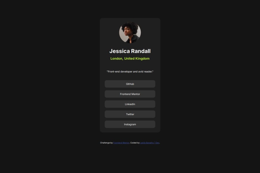


Design comparison

Community feedback
- @ebenkaninPosted about 1 month ago
Hi Leslie, well done on submitting your solution. A few things i feel you could do to improve your solution.
First off, look into using hover: or pseudo classes. They will help you give different colors to your links when a user hovers over them.
Secondly, the links are supposed to lead somewhere so putting paragraphs in divs won't exactly cut it. Going forward, do look into using anchor tags. Eg <a href="#">Linkedin</> to help you render links appropriately.
The next one would be the typography. To get the correct typography, search for the font stated in the readme on font.google and embed that in the head of your code. Then you can use it to give your work a better looking font instead of the default.
Overall, good work and congratulations on your work.
Marked as helpful0@lesliebagalhoPosted about 1 month ago@ebenkanin thanks for comments.
I maked changed and send for new avaliation.
Thanks.
0

Please log in to post a comment
Log in with GitHubJoin our Discord community
Join thousands of Frontend Mentor community members taking the challenges, sharing resources, helping each other, and chatting about all things front-end!
Join our Discord