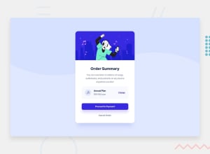
Design comparison
Community feedback
- @AlexKMarshallPosted over 2 years ago
This looks very good. Well done. There are only a few things I could find that would be worth fixing.
When you shrink the screen down below about 330px, the price and the change link start to overlap each other. If you put
flex-wrap: wrapon the container, that will make sure they stay readable if there isn't space to show it all on one line.When you tab through with a keyboard, the proceed to payment link doesn't have a visible focus indicator. That's because the default indicator is blue and blends in with the button color. You could use
outline-offsetto space it out from the button by a couple of pixels. Or you could changeoutline-colorto black, to give enough contrast.The text size on mobile (particularly the price) is a bit small and difficult to read. 11px is very small. I would be very careful with anything under 14px, especially for something as important as price information.
In general, it looks like you built this desktop-first. That's fine, and it works, but it can be easier and more efficient to code mobile-first, and then only make changes in media queries for desktop.
Marked as helpful1
Please log in to post a comment
Log in with GitHubJoin our Discord community
Join thousands of Frontend Mentor community members taking the challenges, sharing resources, helping each other, and chatting about all things front-end!
Join our Discord
