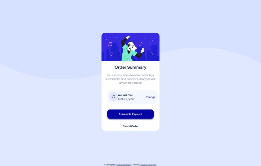
Design comparison
Solution retrospective
Feedback is welcomed!
Community feedback
- @hitmorecodePosted over 1 year ago
Nice well done. Just a few tips
- Make it a habit of using
min-height: 100vh;instead ofheight: 100vh;. With min-height the page will be responsive, because you are setting a minimal height. With height, the height of the page will be fixed at the given value. - The background image is not crossing the width of the page, to fix this you need to add
background-size: contain; - When using flexbox you don't need to add
flex-direction: row;by default flexbox is always set torow - On
.mainyou have amin-width: 20rem;change it towidth: 20rem;. This will prevent the card from been squeezed in the width as the screen size gets smaller - The annual plan section is a bit off to the right, see if you can center it.
1@j-masumaPosted over 1 year agoThank you so much @hitmorecode for your feedback. I will surely set these things.
0 - Make it a habit of using
- @PastequeMurePosted over 1 year ago
For you background image. The size isn't feat the view.
    display: flex;
    flex-direction: column;
    justify-content: center;
    align-items: center;
    height: 100vh;
    font-family: 'Red Hat Display', sans-serif;
    font-size: 15px;
    background-image: url(./images/pattern-background-desktop.svg);
    background-repeat: no-repeat;
    background-size: 100%;
    background-color: hsl(225, 100%, 94%);
}
With "background-size" you can fit viewport
0@j-masumaPosted over 1 year agoThanks @PastequeMure. I will improve these things. And will be looking forward for your further feedbacks.
0
Please log in to post a comment
Log in with GitHubJoin our Discord community
Join thousands of Frontend Mentor community members taking the challenges, sharing resources, helping each other, and chatting about all things front-end!
Join our Discord
