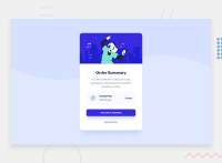
Design comparison
Community feedback
- @skyv26Posted almost 3 years ago
Hi! Kunal , To solve accessibility issues:
- Either use div instead of main tag as you have used main tag and inside the main tag you have assigned role for it. OR just simply remove role attribute from your main tag.
From one of above will solve your report issue, same applied for footer.
- You did one thing wrong
<img src="/images/icon-music.svg" alt="Music Icon" width="40rem">
never use units in html attributes like width and height Do this
<img src="/images/icon-music.svg" alt="Music Icon" width="40">- start your headings with <h1> and move up by one level each time
Good Luck ;)
1@ryu-kamiskiPosted almost 3 years ago@skyv26 Thank you for the feedback. I will resolve the issues with the help of your feedback and also update it so it is more scemantic and clean.
1@skyv26Posted almost 3 years ago@ryu-kamiski after update ,commit and push just come back here and Click on report button, it will open new page, there you will get an option generate report. Click on it and you will see Zero Report.
1
Please log in to post a comment
Log in with GitHubJoin our Discord community
Join thousands of Frontend Mentor community members taking the challenges, sharing resources, helping each other, and chatting about all things front-end!
Join our Discord

