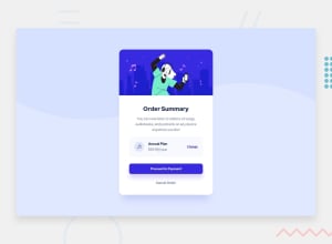
Design comparison
Solution retrospective
If you have any tips or corrections I would be interested in hearing them. Thank you
Community feedback
- @Dharmik48Posted about 3 years ago
Hey👋,
Your solution is actually really great! But some suggestions I would say are that give a
height: 100vh;to your body or the container to make it full screen sized and a little thing you can add is give some transition on hover state.Apart from these 2 your solution is really nice!
Marked as helpful1 - @grace-snowPosted about 3 years ago
Hi
Content is touching/overflowing screen edges for me on mobile (portrait view) and shows me some white space at the bottom as I scroll down
The text in the proceed button is too small to read too.
Other than that, looks really good, just some learning points for you
- content inside the body should be contained by landmark elements. You could move bg class to body and delete that div, or you could change it to have a role of presentation. Then change main app div to be a main element, and attribution to be a footer
- the music icon should have an empty alt attribute, no description because it is decorative/meaningless
- change button should be a button as it would probably toggle the price to monthly
- proceed button should be an anchor tag because it would trigger navigation
- cancel should be an anchor tag. Really really important to only use interactive elements for interactive behaviour. You can’t click on a paragraph
- it’s important for headings to go in order, so the price heading should be a h2 not h4
- there are a few bits near the top of css that look like they should be removed or are overwritten (two lots of h1 styles, some p font sizes that don’t make sense and get overwritten lower down…). Remove anything that’s not in use
- font sizes must never be in px. Use REM or sometimes em
- are you intentionally using em for paddings/margins? It’s not wrong, but unusual as can lead to alignment issues so wanted to check it’s an intentional choice for some reason
- it’s unusual to place margin and padding on elements, especially low level ones like paragraphs. Usually you would put padding on the white box, then just use vertical margins on the elements inside (either margin-top or margin bottom)
- reduce 6.5em padding on the button (and style class not element). You can set it to be display block or width 100%
- as above, only interactive elements should ever have or need hover effects, never static elements like paragraphs. Make sure you add hover effects to all interactive elements
- also very important to add focus visible styles to all interactive elements. They need to be clear and obvious as they are to serve keyboard or other assistive tech users
I hope this all helps you, good luck
0
Please log in to post a comment
Log in with GitHubJoin our Discord community
Join thousands of Frontend Mentor community members taking the challenges, sharing resources, helping each other, and chatting about all things front-end!
Join our Discord
