Design comparison
SolutionDesign
Solution retrospective
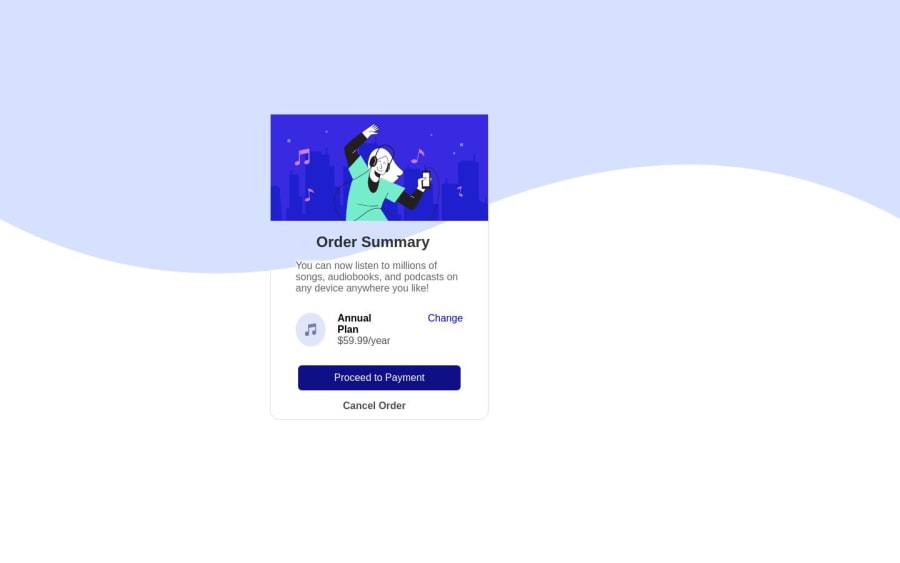
Please tell me if you have any suggestions and improvements , Thaks front End Monetor This Simple Projects Created By HTML CSS only Without Any css frameworks !
Community feedback
- @hitmorecodePosted about 1 year ago
Well done, good effort. I took a look at your page and there are a few issues you can fix.
- You placed the background image inside the html file. This is causing issues with the card. The background image is overlapping with the card. Move the background image to the css file.
- Regarding the other issues with your page I've made some changes (see below). Lines that are commented out, you can delete them. Lines with
/**/are the lines that I added or made some changes. It's a lot to explain right now, but if there are things that you don't understand why I did like this, feel free to ask and I'll do my best to explain to you.
body { font-family: Tahoma, Verdana, sans-serif, Arial, sans-serif; min-height: 100vh; /**/ display: flex; /**/ justify-content: center; /**/ align-items: center; /**/ } .card { /* margin-top: -30vh; */ /* margin-left: 30%; */ width: 400px; /**/ height: auto; /**/ border-radius: 15px; background-color: white; display: flex; justify-content: center; flex-direction: column; align-items: center; /**/ border: 1px solid #ddd; } .card img { /**/ width: 100%; border-radius: 15px 15px 0 0; } .card h2 { /* margin-left: 21%; */ margin-top: 20px; margin-bottom: 15px; opacity: 0.8; } .p1 { opacity: 0.7; /* margin-left: 40px; */ width: 360px; /**/ color: #222; background-color: white; font-size: 16px; text-align: center; /**/ } .music-div { display: flex; align-items: center; /**/ margin: 30px; /* width: 260px; */ background-color: hsl(225, 100%, 98%); padding: 15px; border-radius: 10px; } .salary { display: flex; flex-direction: column; margin-left: 19px; } /* .music-div img { margin-left: 10px; } */ .music-div a { margin-left: 60px; text-decoration: none; } .salary .bold { font-size: 16px; font-weight: 600; } .salary .light { opacity: 0.7; } button { width: 260px; height: 40px; background-color: rgb(15, 15, 134); font-size: 16px; border: none; outline: none; border-radius: 6px; /* margin: 0 auto; */ color: white; /* padding: 10px 0; */ cursor: pointer; } .card h4 { font-family: 'Poppins', sans-serif; font-weight: bold; margin-top: 15px; line-height: 1.2; text-align: center; opacity: 0.7; margin-bottom: 16px; /**/ }0@ahmed9143Posted about 1 year agothanks for these great tips i will add it to this simple card and thank you for your effort @hitmorecode
0
Please log in to post a comment
Log in with GitHubJoin our Discord community
Join thousands of Frontend Mentor community members taking the challenges, sharing resources, helping each other, and chatting about all things front-end!
Join our Discord
