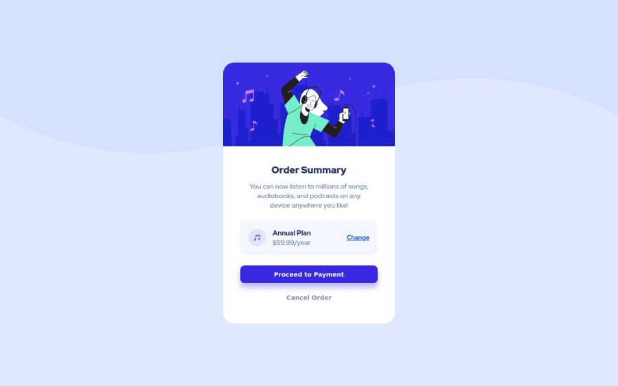
Design comparison
Solution retrospective
All Feedbacks are welcome.
I'm trying to improve my use of html semantic tags so if you're very versed in this area, let me know where I'm using the wrong tags and let me know what tags are more appropriate for what. Thank you
Community feedback
- @emestabilloPosted over 3 years ago
Hey @trafiki, great work! Project is responsive and close to the design.
-
I would apply
min-height: 100vhto themaintag so that the component spans the entire viewport height, and centers the component on the page (with flex). This way, you don't need the top and bottom margins on.order-card. The user will also be able to scroll down if the contents doesn't fit their viewport, better thanheight: 100vh -
The alt text
header-imagedoesn't convey meaningful content. I might just leave the alt attribute empty or use the image as a background -
Good use of interactive elements. I would probably use an anchor tag for 'Proceed' since it usually brings the user to another page to complete payment
Hope this helps!
Marked as helpful3@trafikiPosted over 3 years agoThank you so much @emestabillo. Thanks for min-height hack, I've always wanted that kind of behavior. This was really helpful
1 -
Please log in to post a comment
Log in with GitHubJoin our Discord community
Join thousands of Frontend Mentor community members taking the challenges, sharing resources, helping each other, and chatting about all things front-end!
Join our Discord
