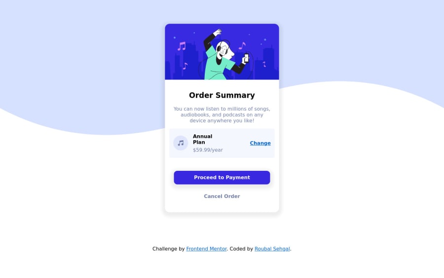
Design comparison
Solution retrospective
Feedbacks are Welcomed - Just Practicing!
Community feedback
- @skyv26Posted almost 3 years ago
Hi! Roubal, I checked your work and tested your design responsievness. I noticed some issues in your work. They are as following:
- First let me tell you about your report issues, you need to do add main tag in your html code and wrap .container class div and .attribution class div inside the main not directly to body .
Do this
<main> <div class="container"> .... .... .... </div> <div class="attribution"> ... ... .... ... </div> </main>-
As I saw that you have not made it fully responsive and below 400 and above 375px your design looks so bad, simply it collapsed and below 360px there is space needed around the card as your card touching the edges of mobile viewport.
-
In Destop and mobile I can see you haven't added background color along with background image.
Overall Good. I hope you understand above issues.
Best Wishes
2@graciedevinePosted almost 3 years ago@skyv26 Thank you, I had the same report issues and did not know the main tag would fix it.
1@roubalsehgalPosted almost 3 years agoHi Aakash (@skyv26),
Thanks for your valuable feedbacks about site responsiveness & the correct way of structuring the HTML tags. Will sure work upon this. 🙂
1 - @graciedevinePosted almost 3 years ago
I just completed this challenge too. The annual plan div was challenging for me when I placed the elements; I really like the way you did it!
1
Please log in to post a comment
Log in with GitHubJoin our Discord community
Join thousands of Frontend Mentor community members taking the challenges, sharing resources, helping each other, and chatting about all things front-end!
Join our Discord
