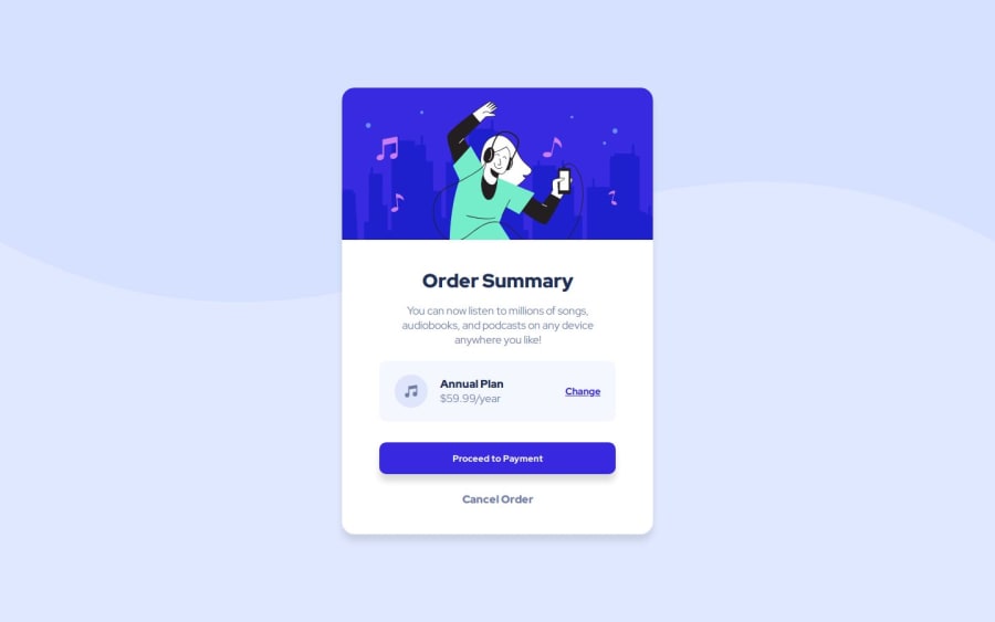
Design comparison
SolutionDesign
Solution retrospective
What are you most proud of, and what would you do differently next time?
Executing the responsive requirements given so the width shrinks slightly and other aspects also change.
What challenges did you encounter, and how did you overcome them?I had a lot of trouble trying to figure out the background. I haven't had an image as a background before and I also didn't realise I could change the color of the rest of the background ( bottom portion of the background ).
What specific areas of your project would you like help with?Where the music icon and the 'Annual Plan' text are sat on the right of the div, is there a better way to have them both be over on the right while the 'Change' text stays on the right.
Community feedback
Please log in to post a comment
Log in with GitHubJoin our Discord community
Join thousands of Frontend Mentor community members taking the challenges, sharing resources, helping each other, and chatting about all things front-end!
Join our Discord
