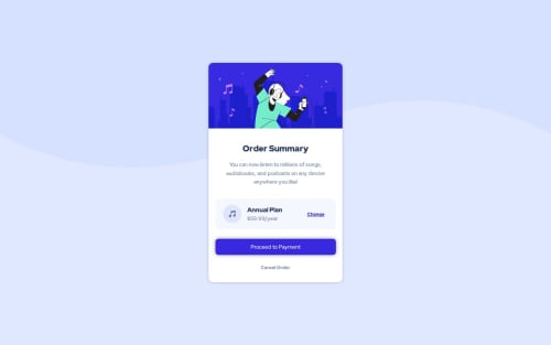
Submitted about 2 years agoA solution to the Order summary component challenge
Order Summary Component - HTML/CSS only

P
@jclegg31
Solution retrospective
Still working on centering DIVS but I think I'm getting better at it.
This challenge didn't look like it had a desktop and a mobile version? I see the info in the style guide says:
The designs were created to the following widths:
Mobile: 375px Desktop: 1440px
But both look mobile. Am I missing something? I only did the desktop version. Would love to know if I missed something. Thanks!
Code
Loading...
Please log in to post a comment
Log in with GitHubCommunity feedback
No feedback yet. Be the first to give feedback on Julie's solution.
Join our Discord community
Join thousands of Frontend Mentor community members taking the challenges, sharing resources, helping each other, and chatting about all things front-end!
Join our Discord