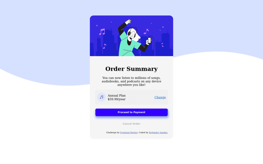
Design comparison
SolutionDesign
Solution retrospective
Please advice if I could improve in CSS and HTML , to make my code more efficient and clean ?
Community feedback
- @cessnar516Posted about 3 years ago
The overall layout looks like it's mostly there - just needs a few tweaks to get it to match the example and take care of the HTML and accessibility issues highlighted in the report for your solution. Here are a few suggestions:
- It looks like like you're missing the Google font called for in the style guide, so you'll need to add a link to that stylesheet in your HTML head and set the
font-familyfor thebody. - Add an empty
altattribute to all of the images since they are decorative:alt="". - Try using semantic HTML elements to define the sections of the page. I suggest at least adding a
<main>inside of the body element and then adding a<footer>element to contain the.attributioninformation. You could change your.order-carddiv to a<section>element too and replace your current sections inside of the.change-boxwith divs instead because section elements require a heading.
Hope this helps!
0 - It looks like like you're missing the Google font called for in the style guide, so you'll need to add a link to that stylesheet in your HTML head and set the
- @dusanlukic404Posted about 3 years ago
Take a look on your HTML and accessibility issues. Also, add background color to body and make attribution outside of the main card
0
Please log in to post a comment
Log in with GitHubJoin our Discord community
Join thousands of Frontend Mentor community members taking the challenges, sharing resources, helping each other, and chatting about all things front-end!
Join our Discord
