Not Found
Not Found
Not Found
Not Found
Not Found
Not Found
Not Found
Not Found
Not Found
Not Found
Not Found
Not Found
Not Found
Not Found
Not Found
Not Found
Not Found
Not Found
Not Found
Not Found

Submitted

Order Summary Component

@EBILITE

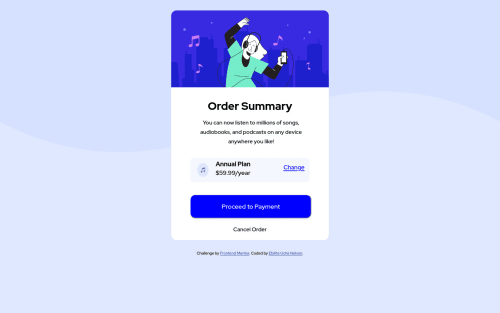
Desktop design screenshot for the Order summary component coding challenge

This is a solution for...

  • HTML
  • CSS
1newbie
View challenge

Design comparison


SolutionDesign

Solution retrospective


Would love if I can receive strong professional, advice in relation to how i can do better

Community feedback

P

@Miculino

Posted

Congrats on completing the challenge, @EBILITE!

Here are a few suggestions based on your final solution:

  • The .annual-cont element needs more padding and the items inside of it aren't properly aligned

  • The p inside .text has a different color

  • When you hover on the "Change" button, the whole card's size gets shifted. That shouldn't happen at all

  • The "Proceed to Payment" button has a border on it that you can remove with "border: none". Also the button should have less vertical space inside of it and be longer in terms of width

  • More space below the "Cancel Order" button. Also, same issue with the hover effect as with the Change button.

0
darryncodes 6,430

@darryncodes

Posted

Hi Ebilite,

Great solution, you pretty much nailed it!

  • you're increasing the font-size on your 'Change' and 'Cancel Order' links, this is making your design jump. You could try transform: scale(1.2); and this would stop them jumping, but i don't think it's necessary, just a subtle change in opacity or colour and this will provide enough feedback to the user
  • you could centre your design nicely in the viewport with this snippet:
display: flex;
    flex-direction: column;
    justify-content: center;
    align-items: center;
    min-height: 100vh;
0

@Sam-Guliker

Posted

Hi Eblite,

Nice solution you've got there, there are a couple of things you can pay attention to. HTML:

  • Try to use landmarks like main, header or footer. link: https://developer.mozilla.org/en-US/docs/Web/HTML/Element/main

CSS:

  • The paddings seem a bit off, you can play a bit more with that.
  • The button seems a bit off in color and doesn't have a drop shadow.
  • The font color in the main section is a bit off.
  • The image within the anual plan needs a width and no height, it will scale accordingly.

I hope this was helpfull

Happy coding

0

Please log in to post a comment

Log in with GitHub
Discord logo

Join our Discord community

Join thousands of Frontend Mentor community members taking the challenges, sharing resources, helping each other, and chatting about all things front-end!

Join our Discord