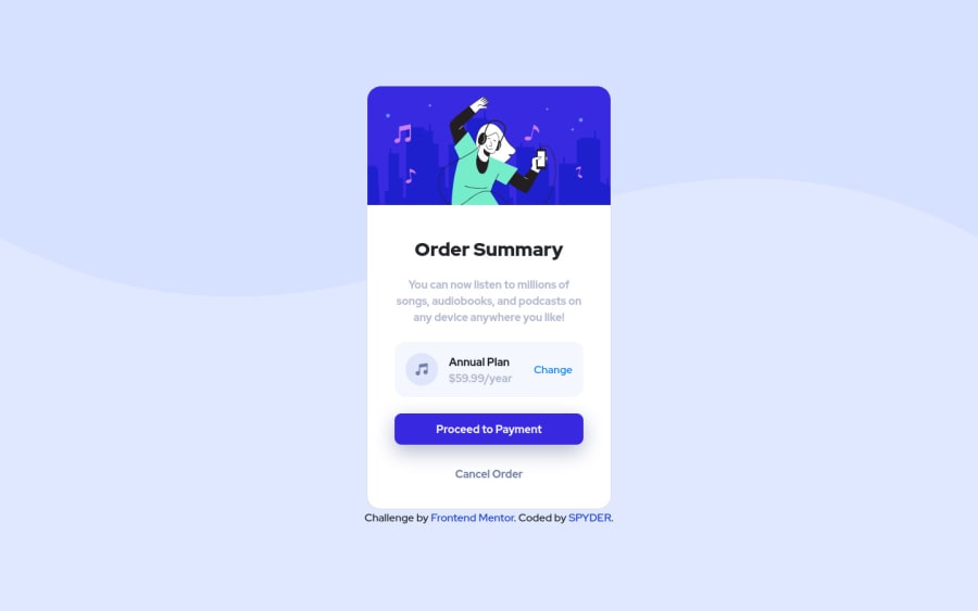
Order Summary Card using flexbox, and a pinch of Bootstrap 4.5
Design comparison
Solution retrospective
🙉💰give feedbacks on my solution and earn guaranteed 5 to 30 points and rank higher up in frontendmentor's world🙉💰
one thing i learned using flexbox is that it isn't reliable. i thought i understood them but it's complicated.
to the people who have solved this challenge just using flexbox, open your browser's developer tools , dock it at the bottom and increase the dev-tools size vertically up and you'll see you lose your top content.
i couldn't understand why this is happening ????
Community feedback
- @emestabilloPosted over 3 years ago
Hi @ratan17, line 4 on your CSS
html, body{height:100%;}is causing it. I would remove it and applymin-height: 100vhto body instead. This allows the user to scroll vertically if their screen is smaller than the page content.Marked as helpful1@ratan17Posted over 3 years ago@emestabillo I can't thank you enough for pointing out my mistake 🙏. your suggestion works perfectly 💯
I just gave up on that height thing..!
couple of things I'd like to ask you is that , should I avoid setting width and height to
html element?and lastly i tried using
min-height:100%instead of 100vh i couldn't understand why percentage didn't work and why vh unit worked ?it would be really generous of you if you could answer my above questions.
thanks again 😇
0@emestabilloPosted over 3 years ago@ratan17 Percentages depend on the parent. Example, if the parent contains only one paragraph, 100% of its height will be based on the height of the paragraph. On the other hand,
vhignores the parent and as the name 'viewport height' implies, depends on the height of the user's screen.My theory for
min-height: 100%is this:min-heightwith a percentage doesn't work on body unless html has an explicit height. html and body don't have intrinsic heights, therefore, their heights are determined by whatever content we place inside them OR if we hardcode a specific height for these tags (not recommended). Hope this wasn't confusing at all! lol. If it was, I'd recommend a bit more reading on heights and min-heights.I think you also don't need to place margins on the body. Flex is doing that for you when you center the component both vertically and horizontally. You'd have to remove
justify-content: flex-startfor it to work.I haven't touched
htmlstyling because I was getting the same bug as you had above lol. Best to leave it alone except maybe for backgrounds or root variables. It's very subjective though :-)Marked as helpful1@ratan17Posted over 3 years ago@emestabillo aahhh gotcha ! I thought setting % height to html will take size according to the viewport size , since viewport is its parent. 🤣🤣
And yes I forgot to update the margin value for breakpoints, did it now.
Thanks a lot Emmilie. I hope I'll see you again in the comments when I'll upload solutions in future. Wish you the best of future ahead. 😇
1 - @tomas938Posted over 3 years ago
Hi, your solution looks good maybe you can add
outline:noneto button i think it looks better without outline ;)1@ratan17Posted over 3 years ago@tomas938 that's due to bootstrap. I'm not bothered about that really. anyways thanks for pointing it out
0
Please log in to post a comment
Log in with GitHubJoin our Discord community
Join thousands of Frontend Mentor community members taking the challenges, sharing resources, helping each other, and chatting about all things front-end!
Join our Discord
