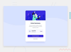
Design comparison
SolutionDesign
Solution retrospective
This was a challenging one 😅. Please do let me know if my approach could be better or a different approach which would be more efficient. Thanks 😀 !
Community feedback
- @HikmahxPosted over 2 years ago
Hi Bilwa! Great solution. I just have a suggestion about the payment button. I think you should use a paler blue and lower the box-shadow a bit, like this:
0px 12px 15px rgb(202 199 240)0
Please log in to post a comment
Log in with GitHubJoin our Discord community
Join thousands of Frontend Mentor community members taking the challenges, sharing resources, helping each other, and chatting about all things front-end!
Join our Discord
