Submitted about 3 years ago
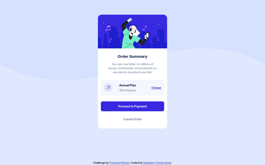
Order Summary Card Component made by HTML and SCSS.
@chetanhaobijam
Design comparison
SolutionDesign
Solution retrospective
Please give your valuable feedback on how can I improve my solution. Please do tell me if there are any issues on my solution.
Community feedback
- @dewslysePosted about 3 years ago
Hello @chetanhaobijam 👋! Congrats on your submission. Overall, nice job. Some things to note:
- You could centre your component to the page with
body { display: flex; align-items: center; justify-content: center; min-height: 100vh; }- Rather than use
background-patternwithposition: absolute, you could easily add the background image to thebodyin css
body { background: url("./images/pattern-background-desktop.svg"); background-repeat: no-repeat; background-size: contain; }- The images are decorative and it's best for them to have
alt="" - Since you've corrected the accessibility and html issues raised, why not generate a new report.
All the best
Marked as helpful0@chetanhaobijamPosted about 3 years ago@dewslyse Thanks for the feedback. I will see to it asap.
0
Please log in to post a comment
Log in with GitHubJoin our Discord community
Join thousands of Frontend Mentor community members taking the challenges, sharing resources, helping each other, and chatting about all things front-end!
Join our Discord
