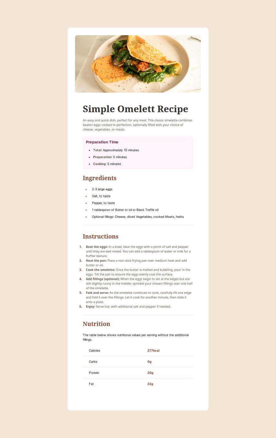
Omelette recipe page
Design comparison
Community feedback
- P@tarasisPosted about 1 year ago
Great job, can't / won't comment on Tailwind / next.js build as I don't know enough.
Its nice and responsive, breaks nicely between the two sizes.
If you wanted me to be really (😹) pedantic there are two things in the "Preparation Time" callout:
First the wrap of "minutes" on mobile isn't in line with Total. However there is alignment further down the page on others that wrap.
Second, in the callout the
:is outside the span, but further down you have the:inside the span. To me both should be inside the span.Marked as helpful0@DevK-EirePosted about 1 year ago@tarasis Always welcome feedback Robert. Thanks mate, I will have a look
0 - @adamrichardturnerPosted about 1 year ago
Nice one Killian!!
0
Please log in to post a comment
Log in with GitHubJoin our Discord community
Join thousands of Frontend Mentor community members taking the challenges, sharing resources, helping each other, and chatting about all things front-end!
Join our Discord

