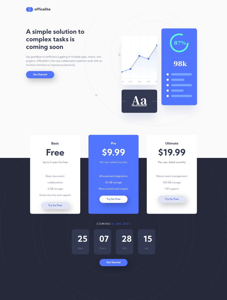
Design comparison
SolutionDesign
Solution retrospective
Hi Guys,
This project started off well, but I ran in to a few problems which have been driving me crazy!
Would love some advise on some of the following points:
- On tablet vp - the ctas in the plan sections. I couldn't work out how to position them at the bottom of the left hand column, without using absolute positioning. When I did this, it then meant that I had to create lots of mqs as the screensize changed, as the ctas were moving up.
- Countdown numbers on desktop/tablet - should be a really simple fix but I can't get the numbers to centre for some reason!
- Form styling - was a bit lost with how to style the inputs and particularly the selects.
- Background-images - again, struggled with these as absolute positioning meant they keep moving on different screensizes and I wasn't sure of the fix.
Cheers
Community feedback
- @JesusAtao96Posted almost 4 years ago
Hello @AndyBeable 👋
countdown numbers are not centered because they have left and right padding, try using a fixed width.
for example:
.countdown__item {
    display: flex;
    flex-direction: column;
    justify-content: center;
    max-width: 110px;
    width: 70px;
    padding: 2.5rem 0;
    text-align: center;
    background-color: #333950;
    border-radius: 5px;
}
Vote up if I helped you.
Happy new year and keep coding 😊.
2
Please log in to post a comment
Log in with GitHubJoin our Discord community
Join thousands of Frontend Mentor community members taking the challenges, sharing resources, helping each other, and chatting about all things front-end!
Join our Discord
