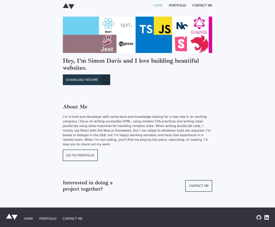
NX, Next.js, Typescript, GetForms.io, and Styled Components
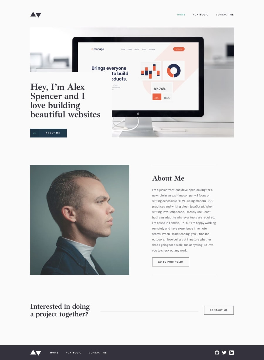
Design comparison
Solution retrospective
This is my new portfolio site based off of the design. In the future, will add a CMS and gather images to do the project details page but I have a more important project to complete.
Community feedback
- @emestabilloPosted over 2 years ago
Hey @Skidragon, looks cool! Interesting take on the portfolio project. Just have a couple of thoughts:
- I would apply a
max-widthto the header so that it doesn't span the entire screen when looking at the project on wide screens. Looks off while the main content terminates at 80ch. - In the portfolio section, I think it's better to put the latest (and presumably, bigger and more complicated) projects on top of the list since those are projects that will likely get the user's attention first. Gives us an idea on where you're at with your skills currently. Just my two cents :-)
Marked as helpful1@SkidragonPosted over 2 years ago@emestabillo I will make an update tomorrow on number 1. For number 2, I would put my complicated projects at top if they were finished lol. Thanks for the feedback. :)
1@SkidragonPosted over 2 years ago@emestabillo I finally made the changes for number 1 and number 2 since I got my more complex projects kind of show worthy. Also added keyboard accessibility.
1 - I would apply a
Please log in to post a comment
Log in with GitHubJoin our Discord community
Join thousands of Frontend Mentor community members taking the challenges, sharing resources, helping each other, and chatting about all things front-end!
Join our Discord
