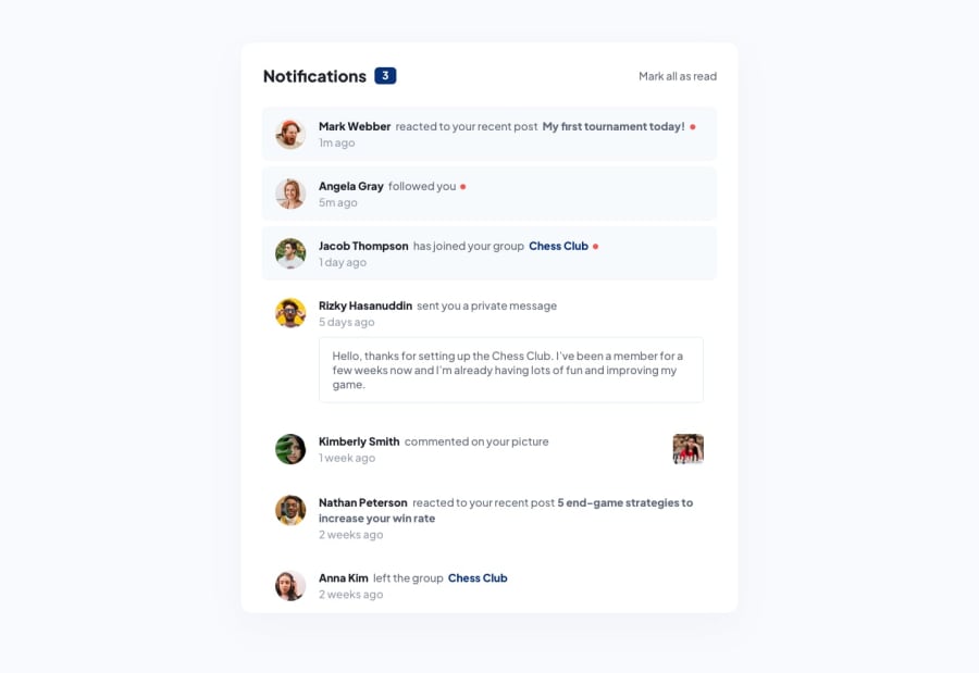
Design comparison
Solution retrospective
Why didn't Anna like the Chess club :(
The chess image was really bugging me, just could not get it to float right for the life of me, tried using float, justify self, justify-content with the container but wasn't having it. I added a margin but messed it up for mobile display so left it how it is. Any help with that is appreciated
Community feedback
- @fontainmPosted almost 2 years ago
I used
margin-left: autoon the chess image to solve it. The parent just needs to bedisplay: flex.You can inspect my solution if you want
0 - @Mirali44Posted almost 2 years ago
Helllo ! I had had the same problem while creating this project.In the end,float:left worked. If you want,you can check the code of this issue in my profile.
0
Please log in to post a comment
Log in with GitHubJoin our Discord community
Join thousands of Frontend Mentor community members taking the challenges, sharing resources, helping each other, and chatting about all things front-end!
Join our Discord
