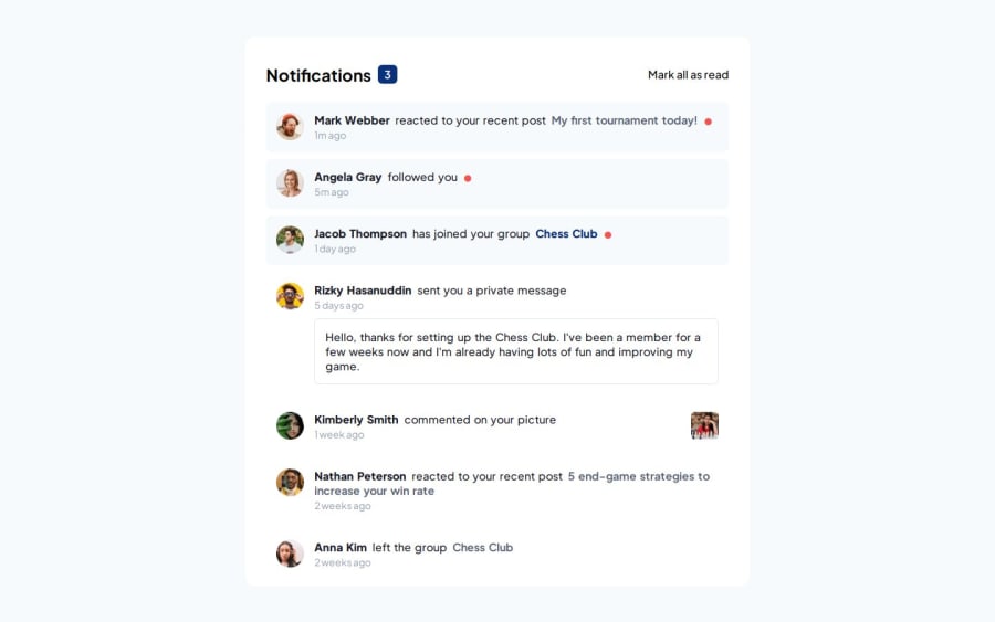


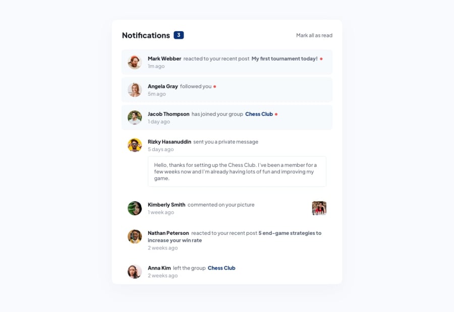
Design comparison
SolutionDesign
Community feedback
- @skyv26Posted 2 months ago
Hi @omnath22
Suggestions for Improvement:
-
Semantics:
- Consider using semantic HTML5 elements like
<section>and<article>instead of purely relying on<div>tags. For instance:<section class="notification"> <article class="image"> <!-- Content here --> </article> </section>
- Consider using semantic HTML5 elements like
-
CSS Improvements:
- Flexbox Layout Refinement: Instead of manually adjusting the widths and margins, try using Flexbox or Grid for more fluid layouts. For example, in the notification
.contentdiv:.content { display: flex; justify-content: space-between; align-items: center; } - Transitions for Hover Effects: Add a
transitionto hoverable elements like.markallfor a smoother user experience:.markall { transition: color 0.3s ease; }
- Flexbox Layout Refinement: Instead of manually adjusting the widths and margins, try using Flexbox or Grid for more fluid layouts. For example, in the notification
-
Accessibility:
- Ensure all interactive elements are keyboard accessible. For instance, you can add
tabindex="0"to.markalland other clickable elements to improve accessibility. - Consider adding
aria-labelto interactive elements for better screen reader compatibility.
- Ensure all interactive elements are keyboard accessible. For instance, you can add
-
JS Functionality:
- If the notification system should have dynamic features like “mark all as read,” consider adding a small script to toggle the notification’s read/unread state (e.g., changing the background color or icon).
- You might also want to integrate a mechanism to delete notifications after a certain time or after being marked as read.
Code Improvement Example:
Here’s an example of how to enhance the hover effects with transitions:
.notification .markall {
  font-weight: 500;
  transition: color 0.3s ease;
}

.notification .markall:hover {
  color: var(--Blue);
  cursor: pointer;
}

.notification .name {
  font-weight: 900;
  margin-right: 3px;
  transition: color 0.3s ease;
}

.notification .name:hover {
  color: var(--Blue);
  cursor: pointer;
}
Summary of Suggested Improvements:
- Use more semantic HTML tags.
- Refine the flex layout for better responsiveness and alignment.
- Add CSS transitions for smoother hover effects.
- Enhance accessibility features, such as
tabindexandaria-label. - Add dynamic interactivity using JavaScript for marking notifications as read.
These changes will help improve the maintainability, usability, and accessibility of your notifications page
0 -

Please log in to post a comment
Log in with GitHubJoin our Discord community
Join thousands of Frontend Mentor community members taking the challenges, sharing resources, helping each other, and chatting about all things front-end!
Join our Discord