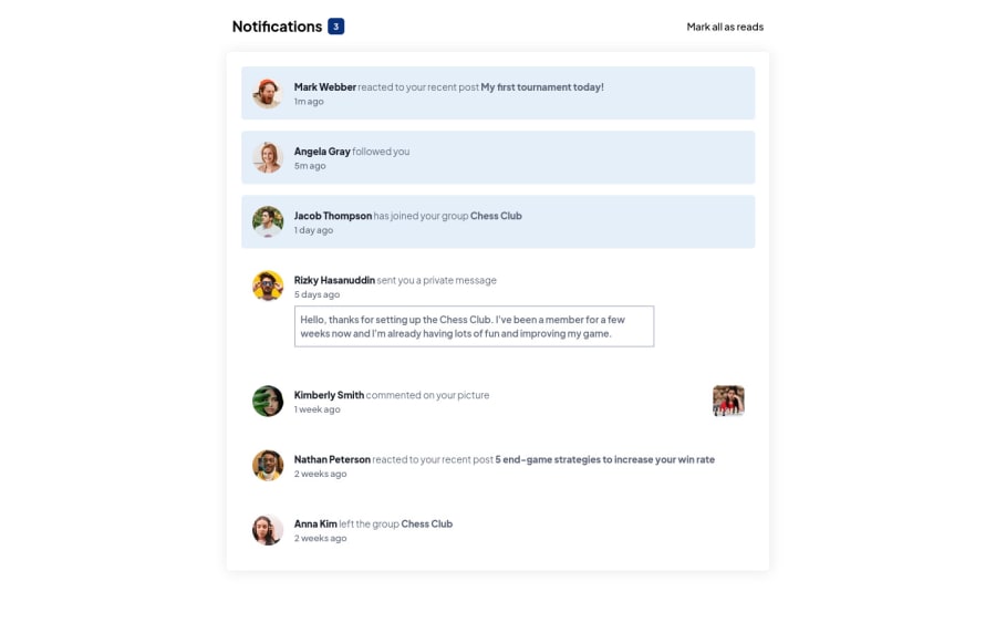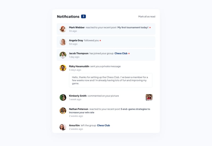
Design comparison
SolutionDesign
Solution retrospective
Please Give Feedback!
Community feedback
- @SatellitePeacePosted about 2 years ago
Hello @dazzlerabhi30800
Nice work but it seems you only did the CSS part of the project which means the JS part is missing
if you only planned on doing the CSS part then you did a great job except for the red dots are meant to show that the first three messages have not yet been read
- to add the red dot you can style the span with the class of circle in your code like so
 .circle{
display: inline-block;
height: 3rem;
width: 3rem;
border-radius: 50%;
background: red;
}
I HOPE THIS HELPS
0
Please log in to post a comment
Log in with GitHubJoin our Discord community
Join thousands of Frontend Mentor community members taking the challenges, sharing resources, helping each other, and chatting about all things front-end!
Join our Discord
