Design comparison
SolutionDesign
Community feedback
- @FabianWassermannPosted over 1 year ago
Great job! There are some points for improvement.
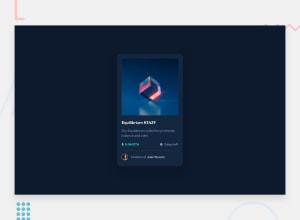
- The user icon is little too big.
- You can use bigger padding/margin on the separator to let the content more space to breath.
All in all, it's a clean design 😉
0
Please log in to post a comment
Log in with GitHubJoin our Discord community
Join thousands of Frontend Mentor community members taking the challenges, sharing resources, helping each other, and chatting about all things front-end!
Join our Discord
