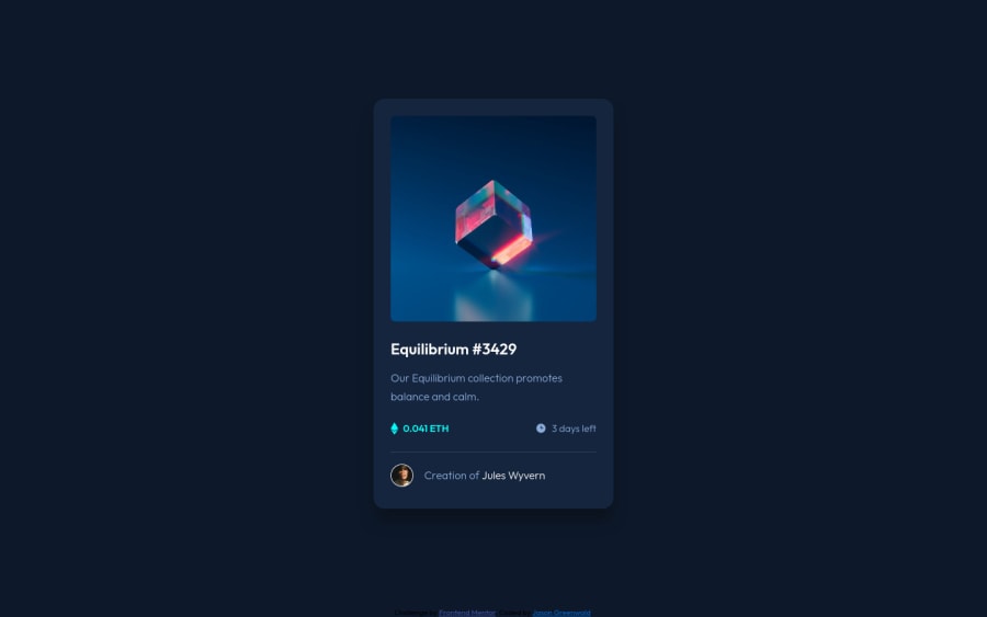
Design comparison
Solution retrospective
Update ** Corrected missing alt tag and background color **
I would love some feedback on my first BEM implementation. Did I follow the naming conventions correctly? What can I do better next time?
I'm curious if there was a more simple way to implement the section I named "card__status". I wrapped the left and right part in separate divs then used Flexbox to space the divs across the section.
Regarding the alt attribute for the images, I left them empty since the images were decorative. Please let me know if this is the right approach or not.
Any accessibility issues I missed and any other feedback on how to improve is much appreciated!
Thank you.
Community feedback
- @shashreesamuelPosted over 2 years ago
Hey good job completing this challenge
Keep up the good work
Your solution looks great however I think that the background color of the body element is supposed to match the color specified in the style-guide.md file.
In terms of your accessibility issue simply specify a description of your image for your alt attribute.
I hope this helps Cheers
Marked as helpful0@jaycgreenwaldPosted over 2 years ago@TheCoderGuru Thank you for the feedback. The background color has been updated. I wasn't sure if I was supposed to add a description to the alt tag since the image was for decoration and wasn't functional. Thoughts? Thanks again!
0
Please log in to post a comment
Log in with GitHubJoin our Discord community
Join thousands of Frontend Mentor community members taking the challenges, sharing resources, helping each other, and chatting about all things front-end!
Join our Discord
