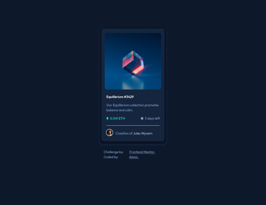
Submitted over 3 years ago
NFT Preview Card Component-CodeSenpai101
#styled-components
@CodeSenpai101
Design comparison
SolutionDesign
Solution retrospective
Any feedback in general would,appreciate it :)
Community feedback
- @UDsGitHubPosted over 3 years ago
Hey CodeSenpai, I saw your solution and it looks great. I really love the way you did the border of the card. The issues I noticed so far are:
- Your hover trigger is over the whole card instead of just the "Etherium" image.
- You could also add
cursor: pointerto your hoverable elements that arent like that by default e.g, anchor tags. - You could add some vertical padding to your body so the attribution part isn't touching the bottom of the page. These are all I have to pick on at the moment, but you can start by taking a look at the report Frontend mentor gave you.
Good luck 👍
Marked as helpful1
Please log in to post a comment
Log in with GitHubJoin our Discord community
Join thousands of Frontend Mentor community members taking the challenges, sharing resources, helping each other, and chatting about all things front-end!
Join our Discord
