


@hitmorecode
Posted
When the width of the page gets to 600px the card stretches to fill the width. See if you can fix this
@ThibautMilville
Posted
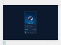
@hitmorecode is it better now ? I changed the responsive to 450px instead of 600.
@hitmorecode
Posted
@ThibautMilville there is something that is breaking your page.
I tried to read through your CSS, but there is so many things going that it's not so easy for me to figure it out.
/* avoid writing CSS like this. If you have a class or id. You can target it directly. What you have done like this it can be very confusing. */
body section.main-container div.price-n-date p.price {
display: flex;
align-items: center;
font-size: 0.9rem;
font-weight: 600;
color: var(--cyan);
}

/* next time do it like this. If class price is your target. Just use that */
.price {
display: flex;
align-items: center;
font-size: 0.9rem;
font-weight: 600;
color: var(--cyan);
}
This makes it much easier to read.
@ThibautMilville
Posted
@hitmorecode Thank you for your advice. In fact, I use a pre-processor (SASS), so that's why the CSS is displayed this way: it's generated automatically. To read my code more easily and understand it, you need to read the SASS file, not the CSS file.
@hitmorecode
Posted
@ThibautMilville ok I'll take a look at your SASS
