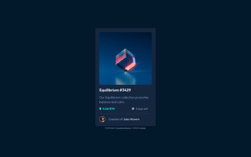
Design comparison
Solution retrospective
Here's my solution using CSS Flexbox as well as absolute position to position the icon-view svg in the active state.
Please let me have any suggestions you have for improving my code.
Community feedback
- @NaveenGumastePosted over 2 years ago
Hello Shane Pinder ! Congo π on completing this challenge
Just one thing:
- Consider using
h2-h6
elements to add identifying headings to all sections.
happy Codingπ
Marked as helpful0 - Consider using
- @msuryaditriputraRPosted over 2 years ago
Hi There π
I wanna congrats you for success to finish this challenge ππ
but I have some feedback for your codes β
- I think you don't need to use
sections
tag, usediv
instead. - Use
box-shadow
for adding shadow on your card, notborder
.
I hope this helps and can improve your code π
Happy Coding β Danbo
Marked as helpful0@ShanePinderDevPosted over 2 years ago@msuryaditriputraR Thanks very much for your feedback!
0 - I think you don't need to use
- @shashreesamuelPosted over 2 years ago
Hey ShanePinderDev, good job for completing this challenge. Keep up the good work.
Your solution looks great, however the height of the card is supposed to be a bit bigger to match the design.
In terms of the validation errors simply wrap all your content within
<main>
tags to get rid of validation errors.I hope this helps
Cheers, Happy coding π
0
Please log in to post a comment
Log in with GitHubJoin our Discord community
Join thousands of Frontend Mentor community members taking the challenges, sharing resources, helping each other, and chatting about all things front-end!
Join our Discord