Design comparison
SolutionDesign
Solution retrospective
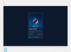
The hover effect with the image had me for a while thanks you youtube and Kevin Powell I managed to figure it out
Community feedback
- @FabianWassermannPosted over 1 year ago
Great job! Here are some points for improvements.
- You can use bigger padding to let the content breath.
- Make sure you are using the right font-family, this one has a large impact on how clean your design is.
- The clock icon is slightly shifted.
Wish you a great frontend day 😉
0
Please log in to post a comment
Log in with GitHubJoin our Discord community
Join thousands of Frontend Mentor community members taking the challenges, sharing resources, helping each other, and chatting about all things front-end!
Join our Discord
