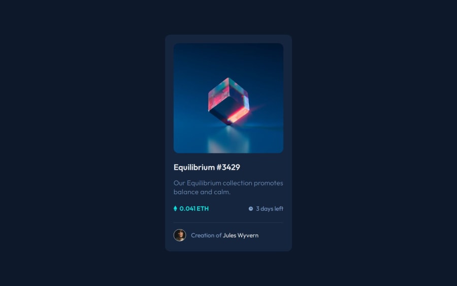
Design comparison
Solution retrospective
Any suggestions are welcome.
Community feedback
- @Crystalis89Posted 2 months ago
Slightly closer match than mine so great job there, although the SVG is slightly off center as my only criticism.
Looks like we had similar idea for the overlay just executed differently.
An alternative way to do the overlay, that I used, was have it be an absolute div with it color transparent that the image covers. That also made is easy to center the SVG as the only element inside of it. Then swap between with a hover to change the image's z-index followed by the overlays to higher as long as hovered.
I noticed it looks like you included a small "reset" in your CSS. You could put that inside a separate CSS file you can just copy between so it easier to recycle. Not sure if that is "best practices" or not but personally I find it cleaner to keep it on it's own, but I also use a much larger one.
Marked as helpful1
Please log in to post a comment
Log in with GitHubJoin our Discord community
Join thousands of Frontend Mentor community members taking the challenges, sharing resources, helping each other, and chatting about all things front-end!
Join our Discord
