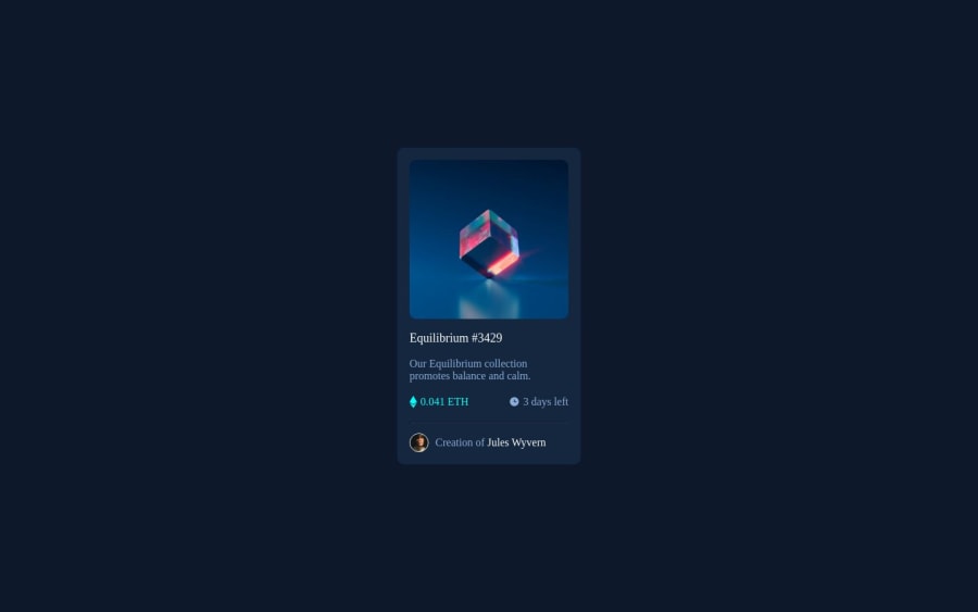
Design comparison
SolutionDesign
Community feedback
- @0xabdulkhaliqPosted almost 2 years ago
Hello there 👋. Congratulations on successfully completing the challenge! 🎉
- I have other recommendations regarding your code that I believe will be of great interest to you.
HEADINGS ⚠️:
- This solution lacks usage of
<h1>so it can cause severe accessibility errors due to lack of level-one headings<h1>
- Every site must want only one
h1element identifying and describing the main content of the page.
- An
h1heading provides an important navigation point for users of assistive technologies, allowing them to easily find the main content of the page.
- So we want to add a level-one heading to improve accessibility by reading aloud the heading by screen readers, you can achieve this by adding a
sr-onlyclass to hide it from visual users (it will be useful for visually impaired users)
- Example:
<h1 class="sr-only">NFT preview card component</h1>
- If you have any questions or need further clarification, you can always check out
my submissionfor another challenge where i used this technique and feel free to reach out to me.
.
I hope you find this helpful 😄 Above all, the solution you submitted is great !
Happy coding!
Marked as helpful0 - @lazy4gyanPosted almost 2 years ago
Congratulations 🎉for successfully completing the challenge!
However, I have noticed few things -
- you are using non-sematic tag try to avoid them as much as you can, use semantic html tag.
- avoid defining colors individually to every selector instead use
:rootpseudo-class for defining global variable and utilize it in your selector as a variable.
Marked as helpful0
Please log in to post a comment
Log in with GitHubJoin our Discord community
Join thousands of Frontend Mentor community members taking the challenges, sharing resources, helping each other, and chatting about all things front-end!
Join our Discord
