Design comparison
SolutionDesign
Solution retrospective
Hey gang!
- Any thoughts/critiques on how I named my custom properties would be much appreciated — first time I've tried to do it.
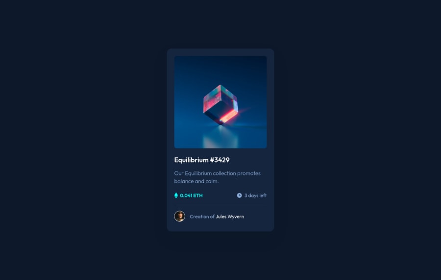
- For the layout of the card, I used Flexbox as I felt this was the simplest way to do it rather than grid for this particular challenge. Any reason why I should've gone for grid instead?
- Only part that felt a bit hacky was how I tackled laying out the area of the card that shows the time left and price of the NFT. Should I have simply gone with another nested flexbox, or was this the better way? Which would cause more problems in the future?
Cheers!
Community feedback
Please log in to post a comment
Log in with GitHubJoin our Discord community
Join thousands of Frontend Mentor community members taking the challenges, sharing resources, helping each other, and chatting about all things front-end!
Join our Discord
