Design comparison
Community feedback
- P@dantviPosted 5 months ago
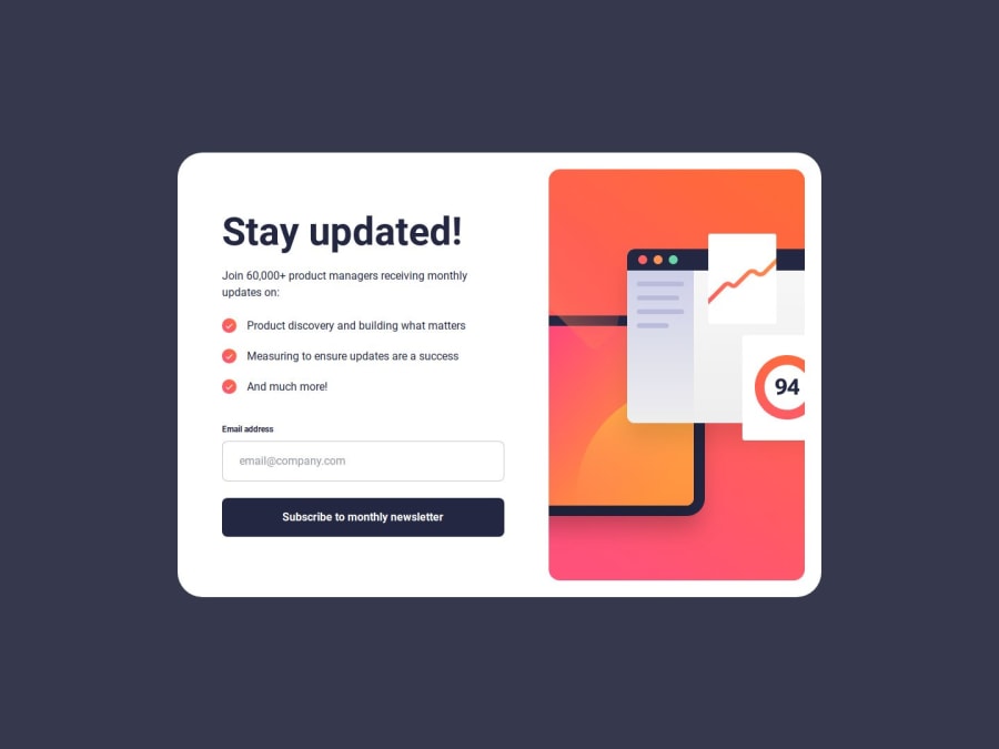
Great work on your newsletter sign-up form! I love the clean and professional design; it’s user-friendly and visually appealing. The success message after signing up is clear and provides excellent feedback to the user, which enhances the overall experience.
Your code is well-organized and generally well-structured! Here are some suggestions for improvement:
• Email Validation Enhancement: Right now, if the email is invalid, the @ symbol is replaced with # in the input value. This can be confusing to users, as they might not understand why the email is being changed. Instead of modifying the input, consider only showing the error message without altering the user's input.
• Empty Input Check: Currently, the empty input check happens after the general validation. It's a good idea to check if the input is empty before checking if it’s a valid email.
• Improving User Experience with Focus: Set the focus back on the input field if there's an error, helping the user fix it quickly.
With these changes, your code should be cleaner, more user-friendly, and easier to follow. Great job on this project so far! Let me know if you have further questions.
Marked as helpful0P@NathanGeovanePosted 5 months ago@dantvi Thank you so much for your feedback 🙏🙏 i agree with you, i'm going to fix those points
1
Please log in to post a comment
Log in with GitHubJoin our Discord community
Join thousands of Frontend Mentor community members taking the challenges, sharing resources, helping each other, and chatting about all things front-end!
Join our Discord
