

Design comparison

Community feedback
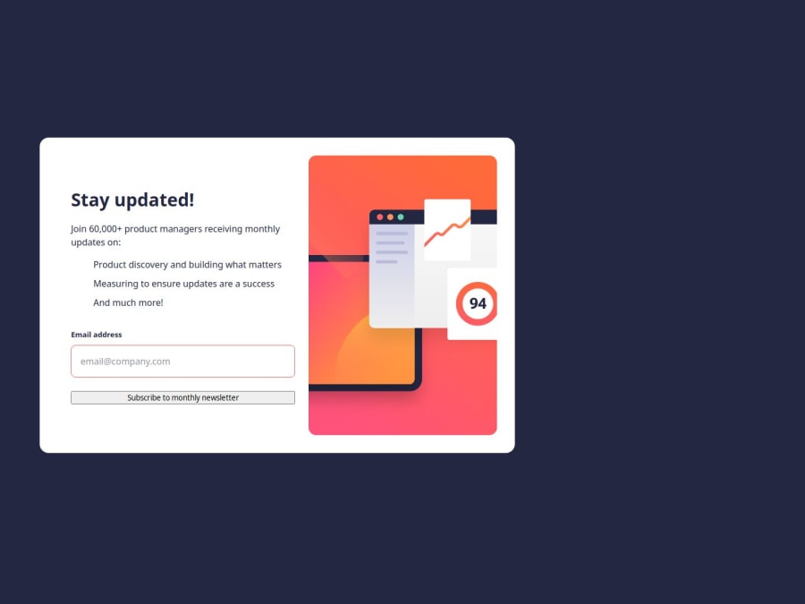
- P@tcaturani-gossPosted 3 months ago
Fantastic job on this project! If I may offer a couple of suggestions for improvement:
Consider incorporating the checkmarks provided in the project assets alongside your bullet points. You can achieve this by using .checkmark-list li::before in your CSS, with content: url('icon-list.svg') and absolute positioning.
Additionally, styling your submit button could enhance the overall design. You might assign a class like user-email-form to your form, then target the button in your CSS using .user-email-form button. From there, you can apply styling properties such as width, padding, border-radius, background-color, and cursor: pointer for a more polished look.
Keep up the great work—you're doing amazing! Keep coding and growing!
0

Please log in to post a comment
Log in with GitHubJoin our Discord community
Join thousands of Frontend Mentor community members taking the challenges, sharing resources, helping each other, and chatting about all things front-end!
Join our Discord