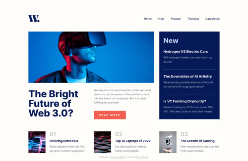
Design comparison
Solution retrospective
it was a good challenge for css grid. i think it was better with a little color adjustment 😉
- Custom components and Responsive navbar created.
- i tried to get all the data from a single json file.
- and worked for the good user experience.
i hope you will like it ✌
Community feedback
- @niemalPosted over 1 year ago
Hello there!
First of all, I want to commend you for the effort you've put into completing this challenge. I can see that you've paid attention to various details, and the overall design is quite impressive.
While reviewing your project, I noticed a small oversight regarding the focus-ability of <a> elements. It appears that the
:focus
state styling is not applied to these elements, which could impact the accessibility and user experience for some users, especially those relying on keyboard navigation.I hope this helps!
Marked as helpful0@bilalturkmenPosted over 1 year ago@niemal Hello Nick,
Thank you for your comment. Getting positive feedback increases my motivation 😊
At first i wanted to make a global style for a:links. then i forgot to add
a
tag to some news links. That's why it skipped keyboard navigation on some links. but now i added it. Now all links on the page can be focused by keyboard. I tested it with the tab key.do you mean also define a custom focus style?
1@niemalPosted over 1 year ago@bilalturkmen that's entirely up to your preference, I like to style mine.
Marked as helpful1@bilalturkmenPosted over 1 year ago@niemal I agree with that.
:focus{ outline }
could impact the accessibility and user experience for some users. so I added a custom:focus-visible
style.I don't use the tab key much. so I couldn't think of it that way. Thanks for this valuable contribution 🙏
1
Please log in to post a comment
Log in with GitHubJoin our Discord community
Join thousands of Frontend Mentor community members taking the challenges, sharing resources, helping each other, and chatting about all things front-end!
Join our Discord