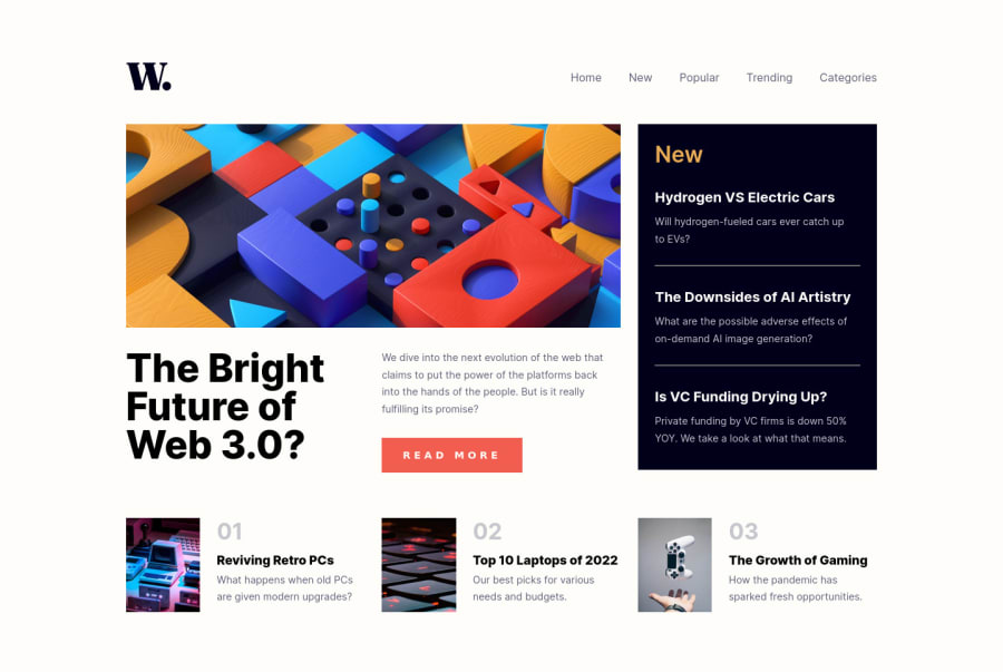
News Homepage in Vanilla CSS & JS using CSS Grid (grid-areas)
Design comparison
Solution retrospective
Hi Guys! Here's my solution to this CSS & JS challenge. First time using CSS grid-areas, so any feedback is welcome! For the JS part, I added a noscroll class on the body to prevent vertical scrolling when the mobile menu is open. I feel like my JS might not be the most efficient, still learning. As usual, any feedback is greatly appreciated! Thank you! ✨
Community feedback
- @CheospherePosted over 2 years ago
@debriks Hi Deborah, what a great job I love your project!... to avoid the horizontal scrolling generated by the mobile menu, you can apply the overflow-x property to the menu container (in your case the container class tag) as hidden, and position as relative:
.container {
  display: flex;
  flex-direction: column;
  overflow-x: hidden;
  position: relative;
}
With this the horizontal scroll should disappear, it is likely that your design will be broken but it will surely be some minimum adjustment of margin and/or padding, no more than that.
Marked as helpful7@debriksPosted over 2 years ago@Cheosphere Thank you so much for pointing this problem to me! The issue only occurs on Chrome browser, the overflow is not showing on Firefox. I tried adding the
overflow-x: hiddento the container like you suggested but it still appears :/ I placed it on the HTML and on the body but it still does not work. I'm gonna look more into it and try to find a fix.Thank you again for your feedback! Your solution to this challenge is great and helped me getting started!
1@debriksPosted over 2 years ago@Cheosphere That's it, I fixed the issue! 🤘 It was not easy but I took your HTML structure as reference and placed my
menuMobile ulinside the header and with some negative margins like you said, I was able to reposition it correctly.Thanks again for letting me know about the problem!
1@CheospherePosted over 2 years ago@debriks Wonderful!!! the mobile menu looks perfect!!! 🎉🎉🎉
Marked as helpful1 - @correlucasPosted over 2 years ago
Amazing work Deborah. Its really accurate the design and everything. Congrats!
Marked as helpful2@debriksPosted over 2 years ago@correlucas Thank you Lucas! It’s always nice these comments coming from you! ✨
1 - @Chiemeka2006Posted over 2 years ago
NIce work it really looks great iwon 't lie
Marked as helpful1 - @Pranshu-SahuPosted over 2 years ago
Hello @debriks , your solution looks amazing.🎉🎉✨
Your solution looks completely 👍 fluid and responsive.
I have spotted some some errors 🤦♂️ in your solution-
-
In smaller screens, using tab key to navigate through your web page hamburger menu opens even if I do not press enter on it.
-
on your webpage👨🔧, when your navabar is offscreen but still contain focusable children. Consider watching video on (accessibility)[https://www.youtube.com/watch?v=fGLp_gfMMGU&list=PLNYkxOF6rcICWx0C9LVWWVqvHlYJyqw7g&index=2].
Hope this helps.
Happy coding.🙂✨🎉👨💻
🎉Wish you all the best for future projects.👍
1@debriksPosted over 2 years agoThank you @Pranshu-Sahu! I’ll look into it this week and will fix those issues. All the best
1 -
Please log in to post a comment
Log in with GitHubJoin our Discord community
Join thousands of Frontend Mentor community members taking the challenges, sharing resources, helping each other, and chatting about all things front-end!
Join our Discord
