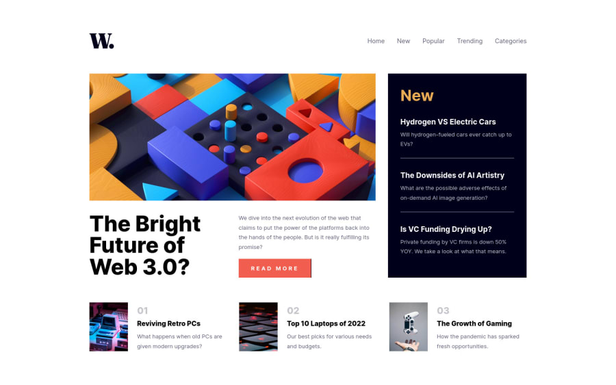
Design comparison
Solution retrospective
Feedbacks will be appreciated
Community feedback
- @Pranshu-SahuPosted about 2 years ago
Hello @adram3l3ch, your solution looks amazing.🎉🎉✨
Your solution looks completely 👍 fluid and responsive.
I have spotted some some errors 🤦♂️ in your solution-
-
In smaller screens, using tab key to navigate through your web page hamburger menu opens even if I do not press enter on it.
-
on your webpage👨🔧, when your navabar is offscreen but still contain focusable children. Consider watching video on (accessibility)[https://www.youtube.com/watch?v=fGLp_gfMMGU&list=PLNYkxOF6rcICWx0C9LVWWVqvHlYJyqw7g&index=2].
Hope this helps.
Happy coding.🙂✨🎉👨💻
🎉Wish you all the best for future projects.👍
Marked as helpful0 -
- @wendyhamelPosted about 2 years ago
Nice one here! I like the transition of the 'read more' button. Interesting trick for the toggle of the menu with a checkbox!
There are only two things I think could improve it a little bit:
- increase the size of the top__articles number (to about 2rem I think)
- slow the transition of the menu. (around 0.4s) Makes it easier to see what's going on.
Happy coding!
Marked as helpful0
Please log in to post a comment
Log in with GitHubJoin our Discord community
Join thousands of Frontend Mentor community members taking the challenges, sharing resources, helping each other, and chatting about all things front-end!
Join our Discord
