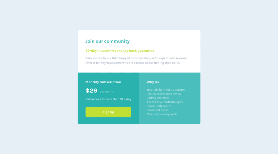
Mobile-first Workflow Price grid component solution using CSS Grid
Design comparison
Solution retrospective
Hi everyone,
Please let me know if you have any suggestion or advice you can offer.
Thanks.
Community feedback
- @techantherePosted over 3 years ago
Overall great solution! except that I don't see any reason to use anchor tag in list items, but it's fine. p tag is preferred over h2 here for "30 day, ..." because headings have a different purpose, keep same styling size as other h2 but it's a paragraph.
Marked as helpful1 - @AchrefFastPosted over 3 years ago
Hi @techanthere,
Thank you so much for taking the time to look into my solution, I really appreciate that.
Considering the list items, I used anchors because I assumed that each item is a link to a specific subject. I actually wasn't sure, since I don't have the design file.
About the "30 day,....", I didn't notice I used h2, thank you for mentioning that.
This was a big help. Thanks again.
1
Please log in to post a comment
Log in with GitHubJoin our Discord community
Join thousands of Frontend Mentor community members taking the challenges, sharing resources, helping each other, and chatting about all things front-end!
Join our Discord
