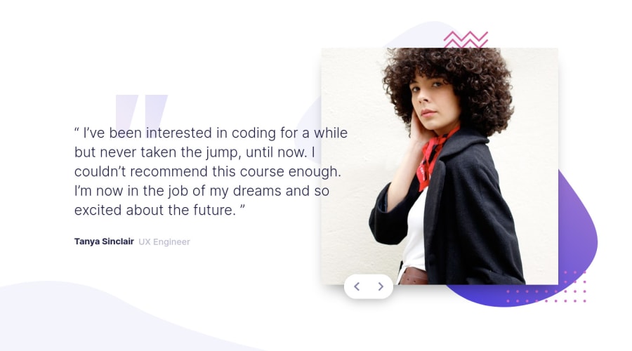
Mobile-first Workflow, Javascript, CSS Grid, Flexbox and Animation
Design comparison
Solution retrospective
Hi everyone,
I would be glad to hear your feedback.
Thanks.
Community feedback
- @paiputPosted about 3 years ago
Nice job! The animations look very good. If you asked I would make them a bit longer. For example:
.testimonial__body .text {
    transition: transform 0.7s, opacity 0.6s, ease-in, -webkit-transform 0.7s;
}

.appear img {
    animation: popup 800ms;
}

.testimonial__body .author {
    transition: transform 0.7s, opacity 0.6s, ease-in, -webkit-transform 0.7s;
}
Greetings and happy coding!
Marked as helpful1@AchrefFastPosted about 3 years ago@paiput
Thank you, Lucas. I think you're right. It looks much smoother now.
Thanks again.
1 - @arshGoyalDevPosted about 3 years ago
Its a nice solution with some good animations
1@AchrefFastPosted about 3 years ago@developingWeb
Thanks Arsh, I'm happy to hear that.
0
Please log in to post a comment
Log in with GitHubJoin our Discord community
Join thousands of Frontend Mentor community members taking the challenges, sharing resources, helping each other, and chatting about all things front-end!
Join our Discord
