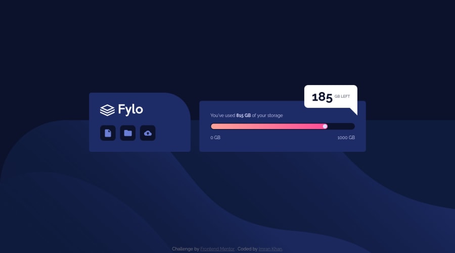
Design comparison
Solution retrospective
- I had to use
position: absolutefor placing the 185 GB left pop-up. Please let me know if there would be a different approach. - Should I use an
<h1>to enclose the logo and name of the card (Fylo) even though it's an image, and we don't have a heading in the component.
Community feedback
- @joshdailPosted about 2 years ago
Really nice job on this project. I also used absolute for getting the pop-up to work. It looks like your solution scales properly when the screen size changes, so I don't see any problem with it being absolutely positioned since it works and displays correctly.
As far as whether to use h1 or img tag, I think that using an img tag, like you did, is better since an h1 tag is meant to be used for actual text. And you have the alt text for the image, so that takes care of the accessibility for the image. On a full website or app you would probably have an h1 somewhere else on the screen, but since this project is just a component I wouldn't worry about the h1 warning.
Also really nice job making the buttons focusable and keyboard accessible!
Marked as helpful0@astr0n0merPosted about 2 years agoHey @joshdail, thanks for taking some time out for checking out my solution.
Really appreciate your feedback.😁
0
Please log in to post a comment
Log in with GitHubJoin our Discord community
Join thousands of Frontend Mentor community members taking the challenges, sharing resources, helping each other, and chatting about all things front-end!
Join our Discord
