

Design comparison

Solution retrospective
I'm open to suggestions.
Community feedback
- @ecemgoPosted over 1 year ago
Some recommendations regarding your code that could be of interest to you.
If you want that this solution is responsive, I recommend some techniques without using media query for this solution but it's up to you whether you use it or not. Also, I recommend you try to avoid repetition in your code.
- If you want to make the card centered both horizontally and vertically, you'd better add flexbox and
min-height: 100vhto thebody
body { font-family: "Outfit"; font-size: 15px; text-align: center; background-color: hsl(212, 45%, 89%); display: flex; justify-content: center; align-items: center; min-height: 100vh; }- When you use flexbox in the
bodyfor this solution, you don't need to use flexbox in the.content-wrapperto center the card - If you use
max-width, the card will be responsive - You'd better give
paddingto give a gap between the content and the border of the card
.content-wrapper { /* width: 23%; */ max-width: 300px; /* display: flex; */ /* justify-content: center; */ /* align-items: center; */ /* flex-flow: row wrap; */ padding: 20px; background-color: white; border-radius: 5%; }- In addition to that above, in order to make the card responsive and the image positioned completely on the card, you'd better add
width: 100%to the img
img { /* display: flex; */ /* justify-content: center; */ /* align-items: center; */ width: 100%; border-radius: 5%; }- You'd better add
font-sizeand updatepaddinginh1andpin this way:
h1 {
  /* display: flex; */
  /* justify-content: center; */
  /* align-items: center; */
  /* padding: 30px 10px 20px 10px; */
  padding: 10px 0;
  font-size: 20px;
}
p { padding: 0 0 10px 0; font-size: 16px; }- If you follow the steps above, the solution will be responsive and you don't need to use media queries for this solution but I emphasize that it's up to you whether you use this method or not.
- Finally, you don't need
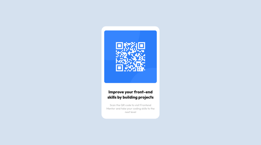
.backgroundand.qr-codeanymore
/* .background {
    padding-bottom: 200px;
} */

/* .qr-code {
    margin: 20px 0;
} */
Hope I am helpful. :)
Marked as helpful0@CaseyLawverPosted over 1 year ago@ecemgo Thank you for your feedback. I will work on it!
1 - If you want to make the card centered both horizontally and vertically, you'd better add flexbox and
- @tinuolaPosted over 1 year ago
@Casey, nice effort.
Your solution/layout is breaking once the screen is resized down.
A few things to simplify your code and still get you to the finished result/effect:
-
There's no need for media queries in this project since the size never changes across resolutions.
-
Instead, remove the 23% width you've set on the content-wrapper; try using an absolute width instead, such as max-width: 320px;
-
The flex properties on the background should instead go on the body element; and use align-items: center rather than align-self. Add the background color to the body as well. Give the body a min-height of 100vh.
-
Once you do this, you can remove the rest of the declarations on the content-wrapper except the color, radius and padding.
-
There's also no need to add flex properties to the image or the h1.
Marked as helpful0@CaseyLawverPosted over 1 year ago@tinuola Thanks for your feedback! This was my first time building something totally from scratch so I really appreciate it!
1 -


Please log in to post a comment
Log in with GitHub
Join our Discord community
Join thousands of Frontend Mentor community members taking the challenges, sharing resources, helping each other, and chatting about all things front-end!
Join our Discord