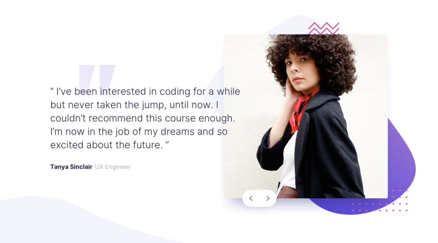
Mobile-first design using Flexbox with swipe touch navigation
Design comparison
Solution retrospective
Any feedback is greatly appreciated!
This is the first time I tried mobile-first. If you can give feedback on that it will be awesome!
I was thinking should I have put transitions in between the testimonials? What do you think?
Community feedback
- @emestabilloPosted over 4 years ago
Hi Jean, it's me again 😄 Awesome first attempt at mobile-first! Slider works well and you even added your own slide lol. Just a few notes. I think for this case, it'll help if you set a fixed width for the photos (like in px/rem/em whatever you prefer). It will control the proportion better for every screen width. They seem to be huge at 460px to 600px, and the text are small in comparison. Also the arrows, they seem to be out of place in widths 600px to about 1000px. Otherwise, doing great!
2@jeantistonPosted over 4 years ago@emestabillo Hey Emilie! I really appreciate the feedback. I added the 3rd slide cause I wasn't sure if I got the slider direction right haha. I should've removed it. Anyway, yeah, that's true the image and arrow do seem to get out of whack on those sizes. Thanks for the suggestion!
1 - @VijayKumarKTGPosted over 4 years ago
I viewed your designed and it is great and of course, you should add transitions. I would like to recommend that you should use background-image and its sibling properties altogether using only background property. It reduces the code and makes more clear. Have a great day and enjoy coding! 🥳👍
1@jeantistonPosted over 4 years ago@VijayKumarKTG Thank you for your feedback! That's true, it does seem cleaner to use the background property. Will keep that in mind. Thanks!
1
Please log in to post a comment
Log in with GitHubJoin our Discord community
Join thousands of Frontend Mentor community members taking the challenges, sharing resources, helping each other, and chatting about all things front-end!
Join our Discord
