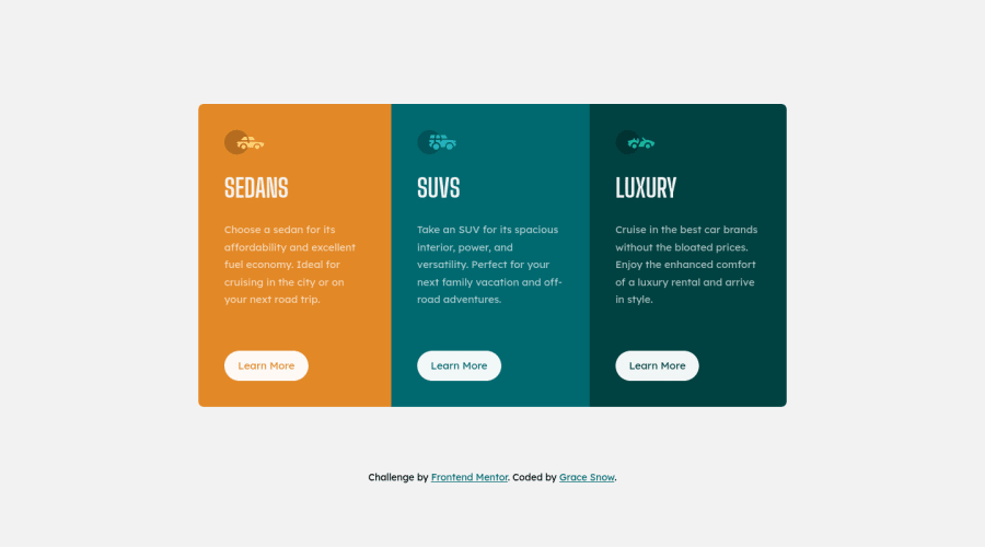
Design comparison
Solution retrospective
No specific questions, but as always feel free to suggest improvements or question why I've done things the way I have.
I would usually create spacer variables for use on things like font-sizes and paddings, but didn't for this one as it's so small and as I don't have the original design files. This means I am just guessing on sizes - hence random 'magic numbers' in the scss
Community feedback
- P@shashiloPosted over 3 years ago
Great job Grace. I really enjoyed how thorough you were with accessibility. The H1 was a nice touch. I did find some things that I'd like to highlight:
- The naming convention doesn't follow a true
BEMnaming. There looks to be nested block names inside elements. EX:c-showcase__card-title - I'm not sure why you're using
EMunits inc-showcase__card-btnwhen you already haveREMset to 16px as the default. This will be a problem if you every nested this component.
And now for the nit picky items:
- The width and height of both desktop and mobile are off. Desktop more than mobile. On Desktop, because your solution is smaller, all of the margins and paddings do not match the design.
- The content inside the card, space between image, title, body, and button are off.
- The button padding is not accurate.
- The card body content has an
opacityof 0.9 right now, but the design looks much lighter. - I'm not sure what justifies the breakpoint at
680px. I'm used to using a common standard breakpoint< 768pxwhich will accommodate for allmobile/tabletscreens from0 to 767px.
2@grace-snowPosted over 3 years agoThanks @shashilo
- The naming follows a component naming system that still uses BEM. The component is treated as the only block
- I intentionally use em for padding on buttons so that it will scale when the font size is changed. This allows for size modifiers that only need to change the font size (
btn—large) and can improve readability for supe-enlarged and/or zoomed views because the space around the element increases proportionally
With all the others I don’t even try to match specifics on these challenges. If I was pro member I would have and use the figma file to make these accurate, but am not going to worry about that when working from static images 😊
1P@shashiloPosted over 3 years agoBEM can be enhanced to whatever you and your team feels is best. I was just mentioning that it didn't follow the proper BEM mythology.
If you want the font to be responsive, you should use clamp() instead of EM. Clamp() is a more stable and modern way to make responsive fonts.
Correct. The goal isn't to be pixel perfect, but it you should have a high level of detail when you implement. I too am not a Pro member, but I can see issues by pulling up the design and implementations side x side. I've worked with several designers and product owners who cared about every single pixel. I was lazy with my implementations early in my career until I was pushed to implement pixel perfect to what the designer had provided. They put their research and skills into designs, it's our job to make them come to life. So they're going to ensure that this process is as precise as possible.
2 - The naming convention doesn't follow a true
- @vanzasetiaPosted over 3 years ago
👋Hi Grace!
Your solution looks great on landscape and portrait mobile view 🙌.
I have some questions for you:
- I notice that you prefix most the class name with
c-. What is that for? - Also, for the car icons, do you think all images needs
widthandheightattribute for better CLS? The idea is coming from a web dev article about Optimize Cumulative Layout that I read. - Is there a specific reason to use CSS custom properties instead of Sass variables?
That's it! Thanks in advance!
2@grace-snowPosted over 3 years ago@vanzasetia that’s a good point, they should have width and height really. And that’s easy to add in this case.
The
c-prefix stands for component. Strictly speaking I would also use other prefixes likeu-for global utility classes etc but I find this is the only one needed a lot of the time (in a real project, I know everything about this will live in the components directory)CSS custom properties can be changed “live” in the browser so are particularly useful for things like color theme toggles (I’m way over simplifying but that’s one common use/reason). In this particular challenge I could use either and it would make no difference
2 - I notice that you prefix most the class name with
- @emestabilloPosted over 3 years ago
Hi Grace! Just curious why the container div is a
divinstead of something like aul. This layout is very common and I'm still learning accessibility so I'd like to know :-) Looks awesome of course 🙌🏼2@grace-snowPosted over 3 years ago@emestabillo there’s just no reason for it to be a ul. This is standard content that has headings, text and link so the headings already provide enough structure.
Assistive tech users commonly complain that list-itis is the new div-itis these days now that card-based designs are so popular. I would only use a list for card listing component or search results using cards or something if there are loads of them and if it’s helpful for a user to know how many are there and that isn’t communicated anywhere else.
I considered using article or section in here for the cards but again it doesn’t add anything. Article is really for when content could be distributable and section for more distinct content that deserves the extra announcement.
3
Please log in to post a comment
Log in with GitHubJoin our Discord community
Join thousands of Frontend Mentor community members taking the challenges, sharing resources, helping each other, and chatting about all things front-end!
Join our Discord
