Mobile First URL-Shortening Landing Page Using Ajax and LocalStorage
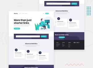
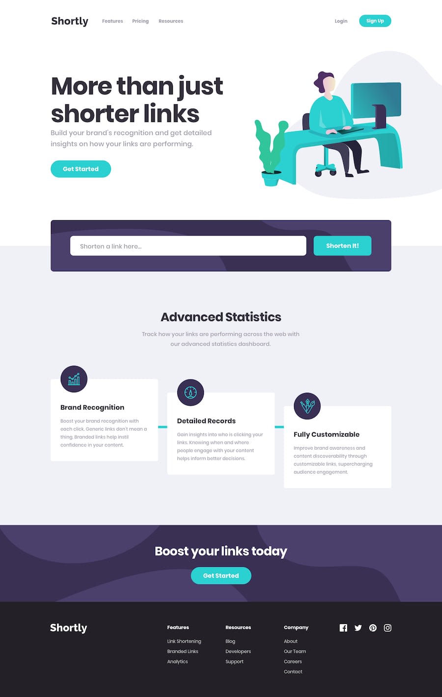
Design comparison
Solution retrospective
This challenge was really fun and interesting, got to learn new ways of storing data in local-storage was a little tricky when making responsive but I solved It.
Implemented all Javascript operations as stated for the challenge make sure you check It.
Would love to hear your feedback Every feedback is a opportunity for me to improve.
Make sure you wait ample amount of time for the api to fetch URLs
Thank You
Community feedback
- @emestabilloPosted over 3 years ago
Hi Aman, great job! Link shortening works well and site seems responsive. The main thing that stood out to me was semantics -
-
There's more than one
h1on the page. I suggest using it only for the header -
There's currently two navs on the header, when you really only need one. Change the styling of a single nav with your breakpoints accordingly, instead of duplicating html.
-
The list items on the header nav should be wrapped in an
atag. This was done in footer nav, but theatags should be inside thelis, and not the other way around. List items should immediately follow theirulparent. -
For the footer nav, I would use a heading tag for the category titles instead of
p -
Social media icons also should be inside
atags as it usually leads the user to another page -
Design-wise, the footer looks a little tight on mobile and medium widths. Some spacing would improve it.
Lastly, it won’t hurt to include a
readmeon your repo. Gives us an insight on your process, tech used, etc.Hope this helps!
Marked as helpful1@Amanpatil-DevPosted over 3 years ago@emestabillo thank you so much for the great insight's I understood everything I will make changes accordingly
1@Amanpatil-DevPosted over 3 years ago@emestabillo your feedback was really inspiring.
Please Do check again as I have refactored everything you said
0@emestabilloPosted over 3 years ago@Amanpatil-Dev Looks better! For the headings, keep them in order and don't skip from h1 to h3. Don't go by how 'big' they look in choosing a heading tag. Here is a great article to explain best practices for accessible headings.
1@Amanpatil-DevPosted over 3 years ago@emestabillo thank you so much for reviewing it again, so generous of you, I will read the article and will definitely apply it on next challenge
1 -
Please log in to post a comment
Log in with GitHubJoin our Discord community
Join thousands of Frontend Mentor community members taking the challenges, sharing resources, helping each other, and chatting about all things front-end!
Join our Discord
