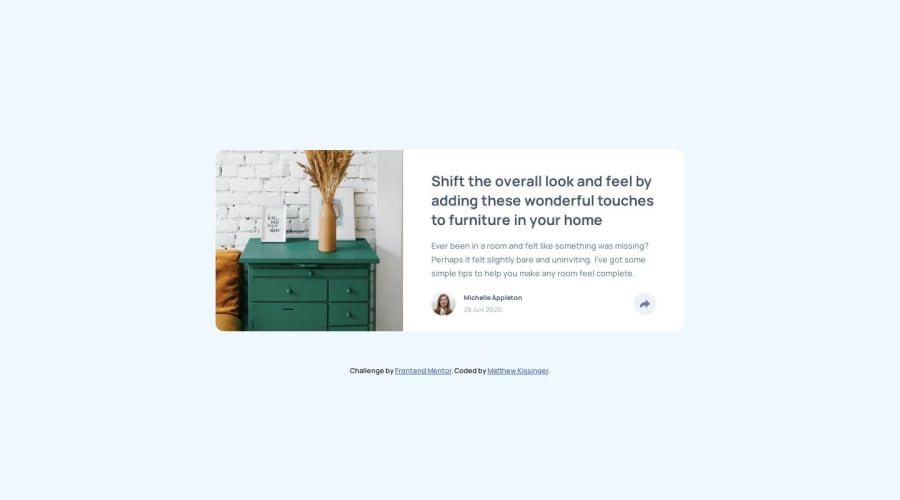
Mobile First Solution starting at 375px using HTML, CSS, and JS
Design comparison
Solution retrospective
-
In order to change the color of the share button arrow to white I ended up using the <svg> tag. Is there a way to change the color of an .svg file in an <img> tag?
-
I'm assuming the light blue background is the device screen size, can someone confirm that?
-
Since the challenge stated it started with a screen width of 375px, that is what I wrote for first. Is it wise to start at very small screen sizes, like say 290px, maybe I should have added another media query? Let me know.
Thank you for your time.
Community feedback
- @emestabilloPosted over 4 years ago
Hi Matt, congrats on completing this challenge! For your questions:
-
In one of the challenges, here's what I did: I copied the image, changed the color of the svg and saved it as a new file. For this challenge, I went another way by using the
filterproperty for the arrow. BTW, you also missed thebox-shadowfor the component like I did lol. -
The light blue background represents the
body(or whatever parent div of the component you used). It's just the space not occupied by the main content. -
Starting with mobile styles is usually recommended. Great job by choosing mobile-first. I don't see a need for another media query. The site looks responsive, awesome!
Hope this helps :-)
2@DarkFMPosted over 4 years agoWhen i click on the share icon I see a duplicate icon appear below it. Just something to keep in mind.
0@MatthewKissingerPosted over 4 years ago@emestabillo
Thank you for the .svg tip. I'll have to give that a try.
Yea, I realized there was a box shadow after I submitted lol.
Thanks for the feedback!
0@MatthewKissingerPosted over 4 years ago@DarkFM
Thank you for the heads up. I will look into this.
Can you tell me at what screen size the duplicate icon is appearing for you? I'm not seeing it on my end. I'm using Chrome's inspection tools if that makes any difference.
Thank you for the feedback!
0@DarkFMPosted over 4 years agoIt appears on the desktop view. I'm using chrome 75 if that helps.
0@MatthewKissingerPosted over 4 years ago@DarkFM
Oh ok. I'm running Chrome 84. I'll look into compatibility and responsiveness for different versions of web browsers.
Thank you for bringing this to my attention!
0 -
Please log in to post a comment
Log in with GitHubJoin our Discord community
Join thousands of Frontend Mentor community members taking the challenges, sharing resources, helping each other, and chatting about all things front-end!
Join our Discord
